German forests under climate stress
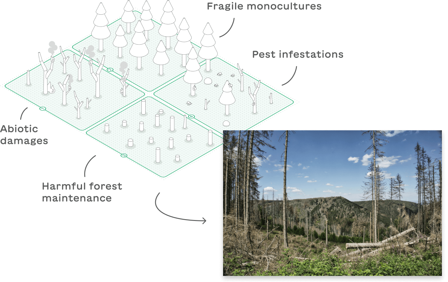
Forests are vital to life on earth. However, in many regions there is an alarming trend toward widespread forest dieback. Factors such as droughts, air pollution and over-intensive forestry put them under constant stress. One way to counteract this trend is to strengthen biodiversity and restore mixed forests.
Stakeholders
Restructuring a forest is a lengthy process and no one knows for sure which tree species can withstand future conditions. However, in interviews with active foresters, we also noticed that the desire for technical support was relatively low. They saw more potential in activating young, inexperienced forest owners.

"Many forest owners are not being reached. The potential for environmental protection and raw materials is not being utilized. We must try to spark their interest."
From an interview with the head of the forestry course (University of Applied Forest Sciences Rottenburg)
Target group challenges
- Lack of time, money or equipment to engage with forest management
- Missing bond to the forest results in lack of motivation to maintain it
- Common fear of making mistakes and causing damage
- Forest-related data are generally not accessible to everyone
Target group
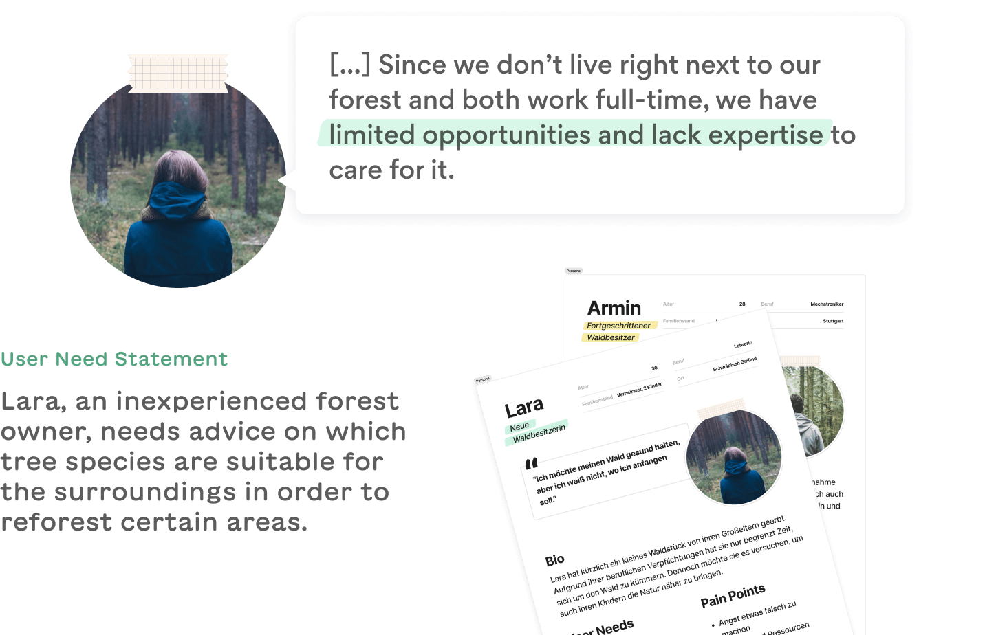
Roughly half of the German forest area is privately owned. Due to continued inheritance, forest lands are becoming more and more fragmented and thus also the number of new and mostly inexperienced forest owners. This makes large-scale forest restructuring difficult. On top of the common environmental issues, inexperienced forest owners face a number of additional challenges.
Project goals
- Remote monitoring made easy through simplified maps and data
- Arouse interest and increase motivation by implementing gamification
- Provide guidance, illustrate processes and opportunities
- Facilitate communication among forest owners and other stakeholders
With our plattform we aim to make remote monitoring more accessible for small private forest areas. Through playful visualizations and elements of gamification, we want to spark interest and motivate users to visit their forest more often and learn more about it.
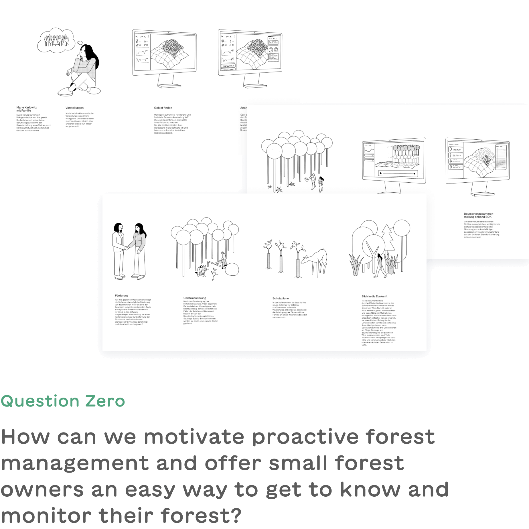
Ideation
In order to find design solutions for the identified user group challenges and to achieve the project goals, we brainstormed different approaches, discussed our ideas and evaluated their feasibility.
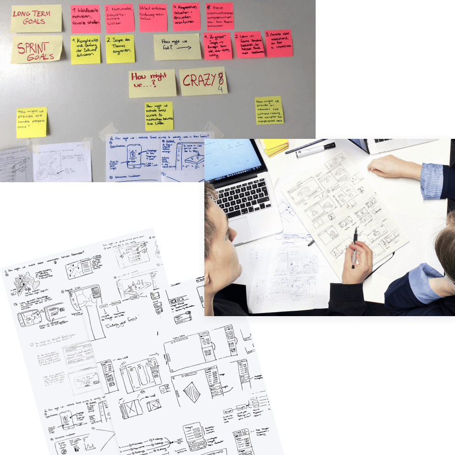
Concept validation
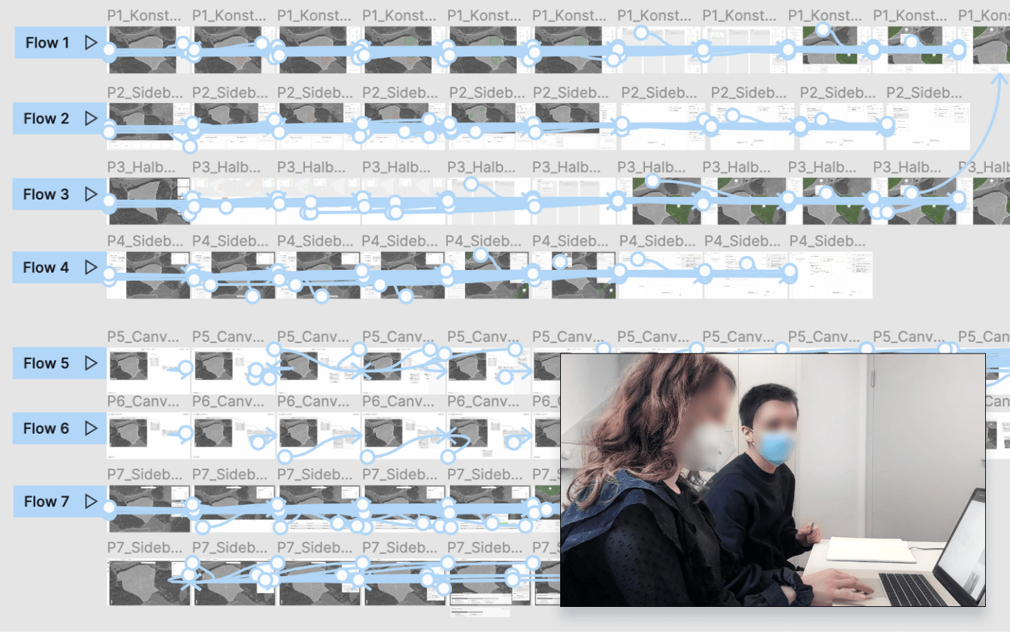
We collected our best approaches and turned them into more elaborate wireframes. In an agile user test phase we validated the results several times. With the help of click dummies we were able to test different use flows and eventually landed on our final design.
System rules
By implementing it as a browser application, we ensure platform-independent access for all users. With the inexperienced target group in mind, the design is deliberately playful and friendly. To visually represent the forest's condition, we combined interface components with illustrations. As users delve deeper into the application and the complexity of the data increases, the design of the modules becomes more "serious."
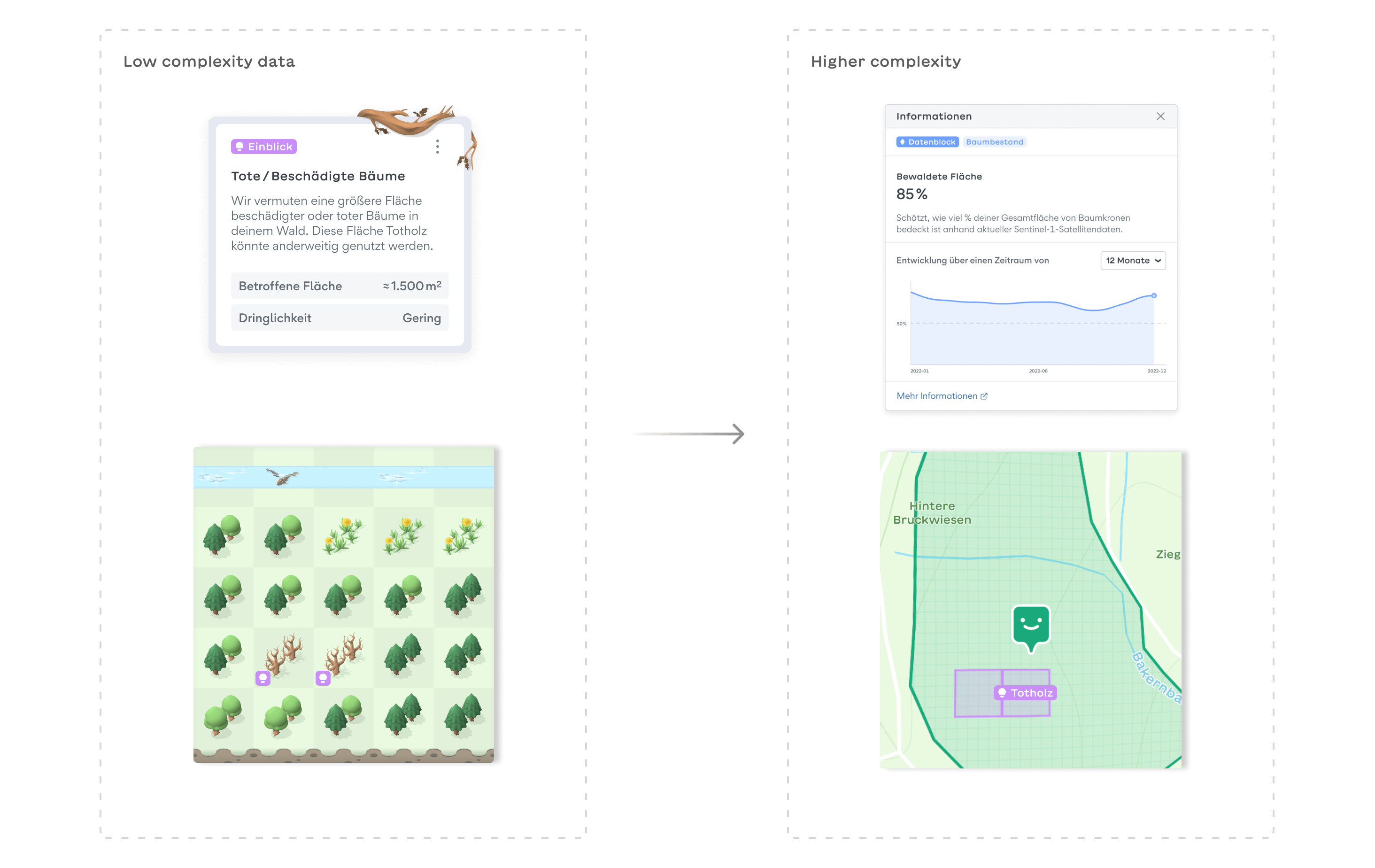

Data basis
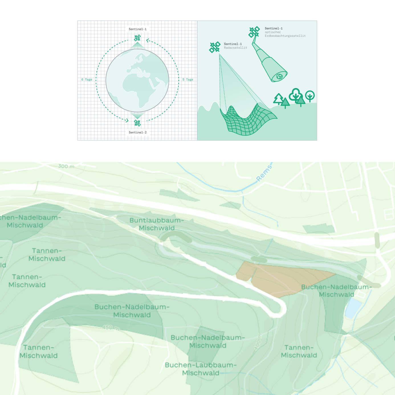
Collecting useful data on forest areas is costly and time-consuming. Remote monitoring through airplanes or satellites like ESA's Sentinel-1 and Sentinel-2 is becoming increasingly important. These satellites capture vegetation changes and are ideal for illustrating temporal developments. We accessed datasets from the Forest Research Institute of Baden-Württemberg (FVA) and imported them into Mapbox for use in prototypes with real data.
Abstracted digital forest twins
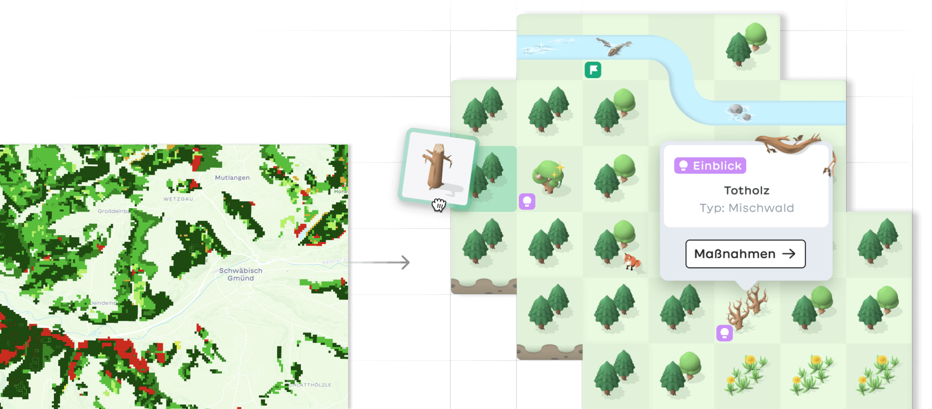
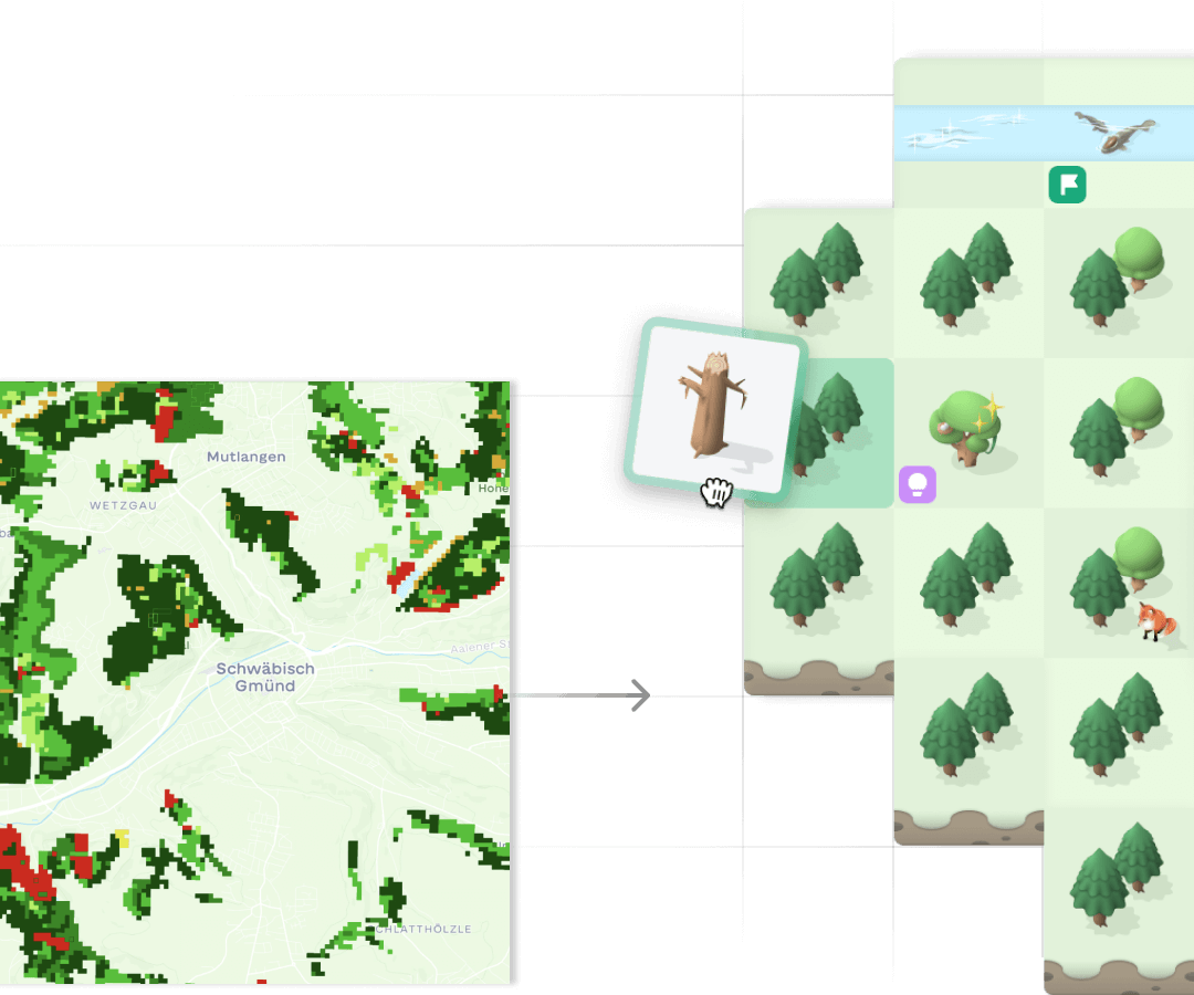
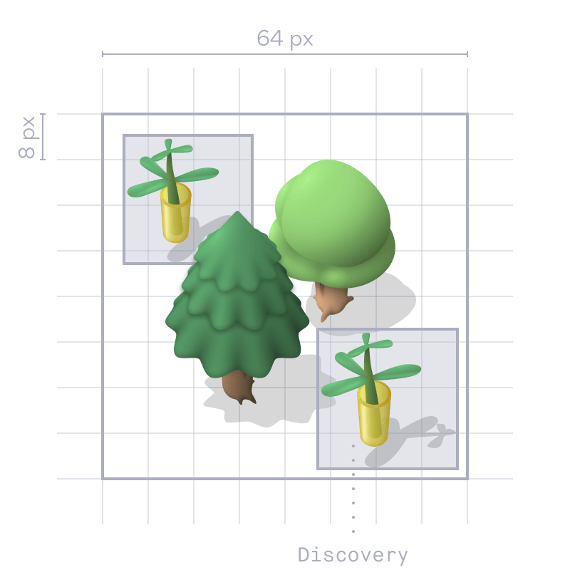
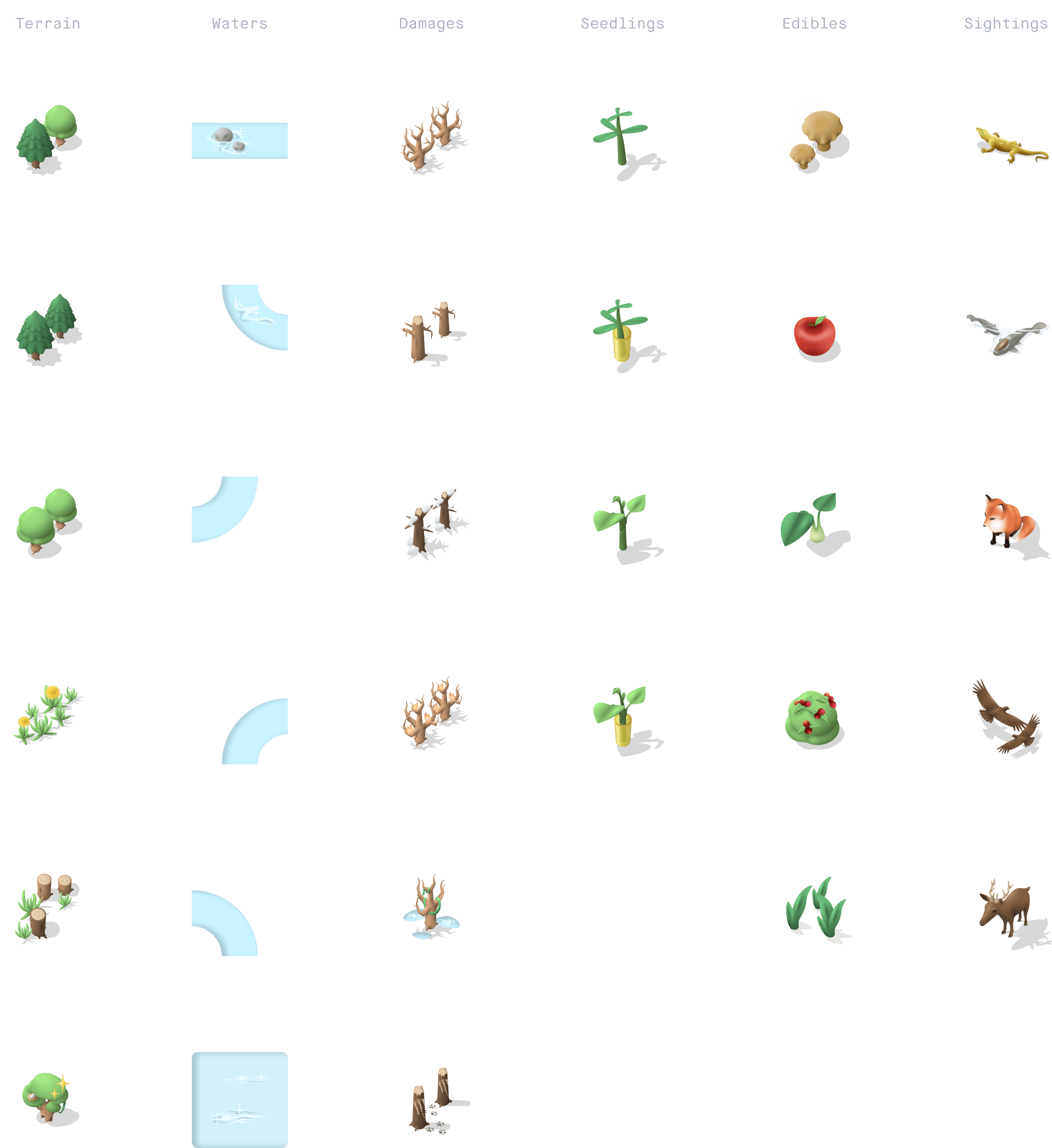
An abstract digital twin reflects an abstracted - but not false! - reality. They help avoid overstimulation by eliminating unnecessary information and give inexperienced forest owners a simpler overview. During onboarding, the user enters his property line. It is then pixelized and translated into a grid layout.
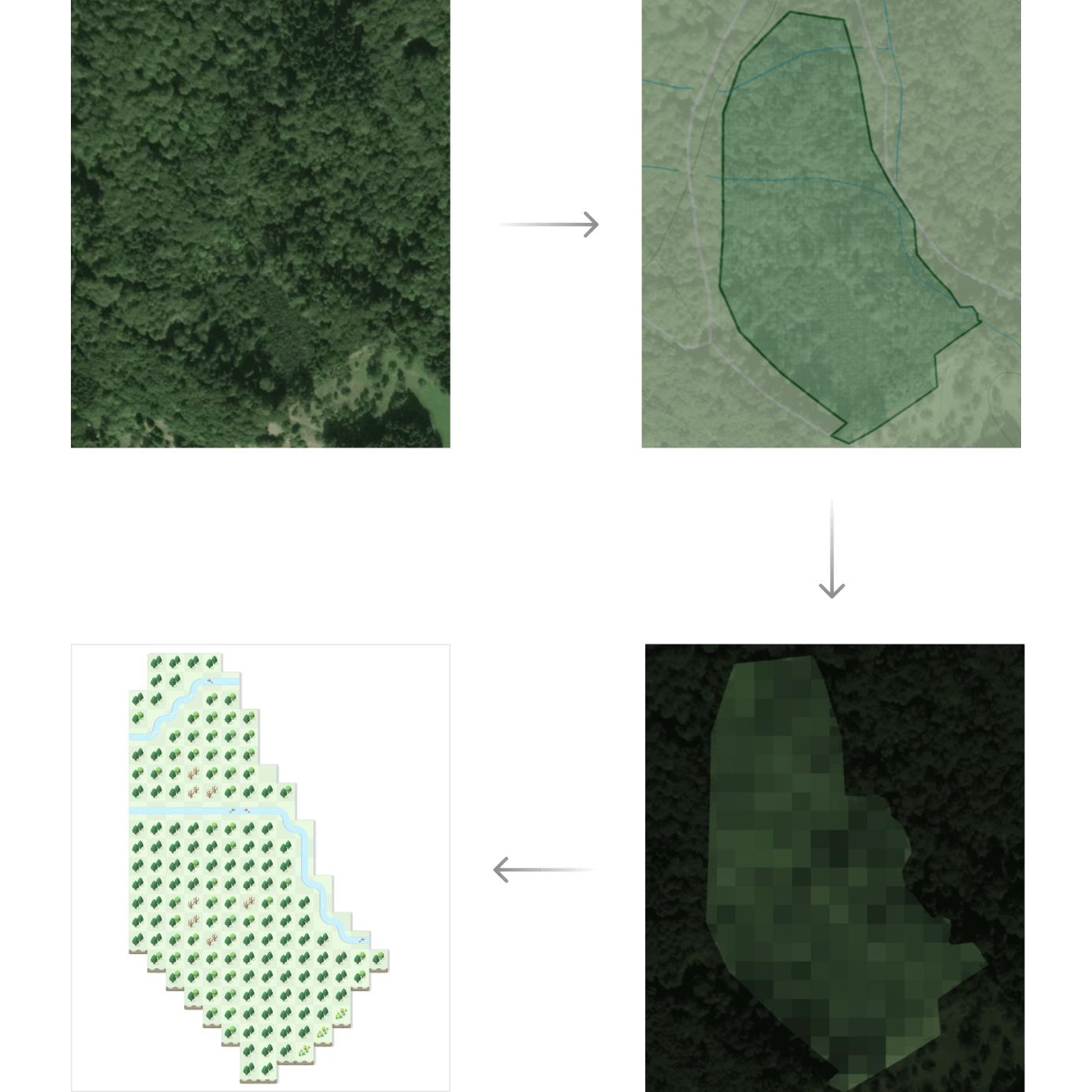
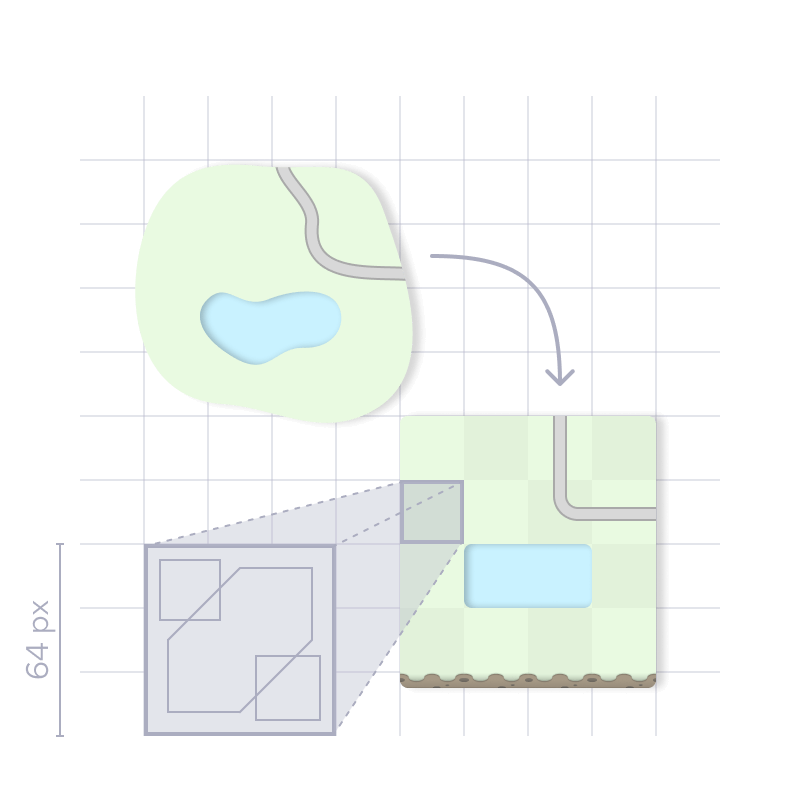
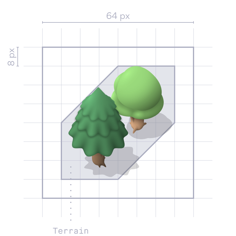
Instead of displaying each tree individually, an average value is calculated. The icons in the center reflect the terrain structure that makes up the largest part of the respective area. For example coniferous forest, waters or grassland. Since the map is based solely on real data, users have no control over its initial construction. Instead, they have to take actions in their real forest in order to have an influence on the digital one.
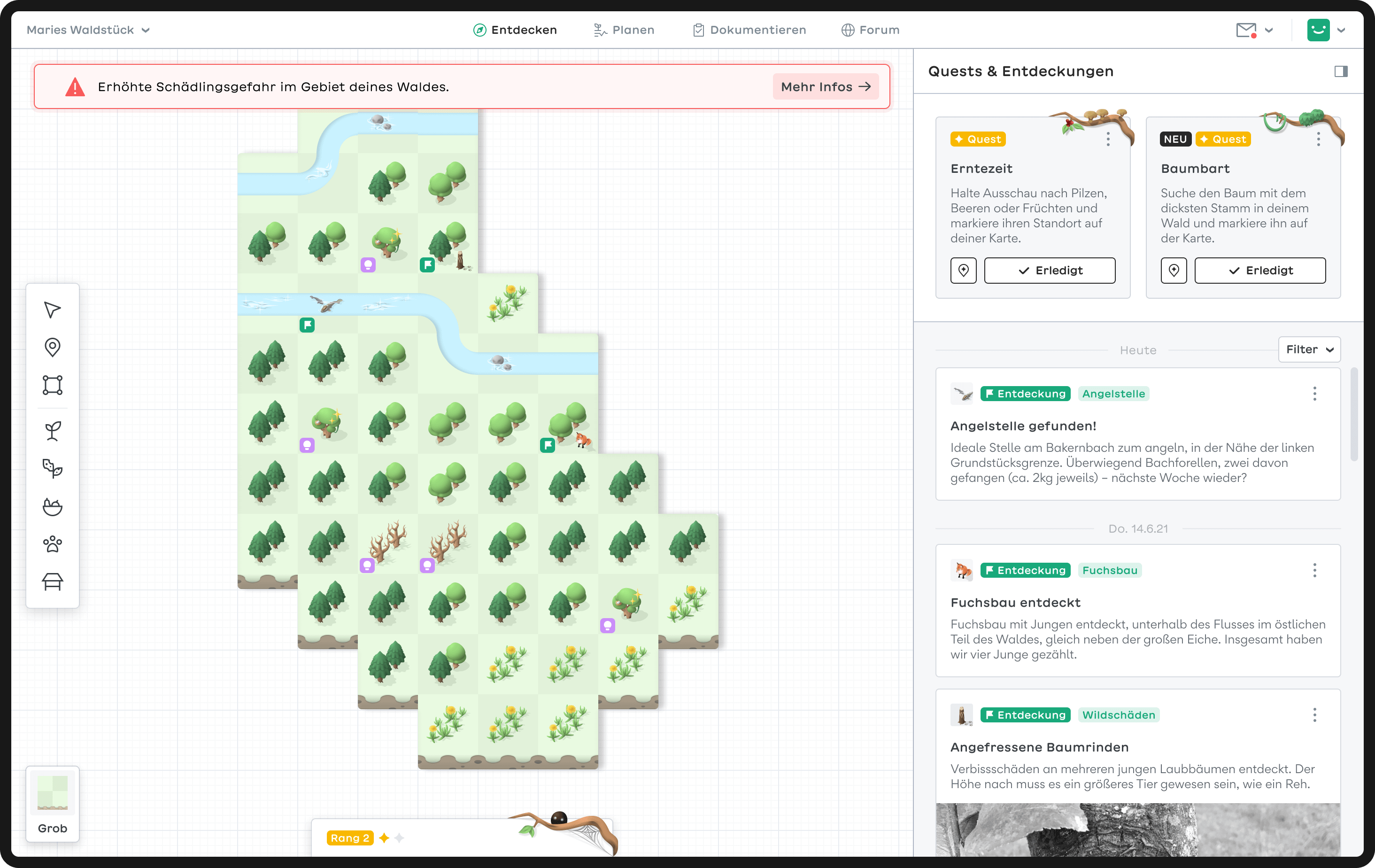
Discover page
After completing the registration process, defining the property boundaries, and stating their goals, the user is directed to the Discover page.
Discoveries
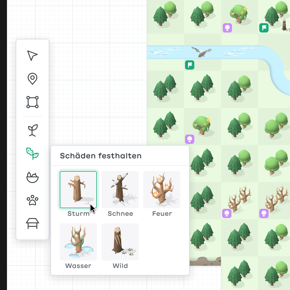
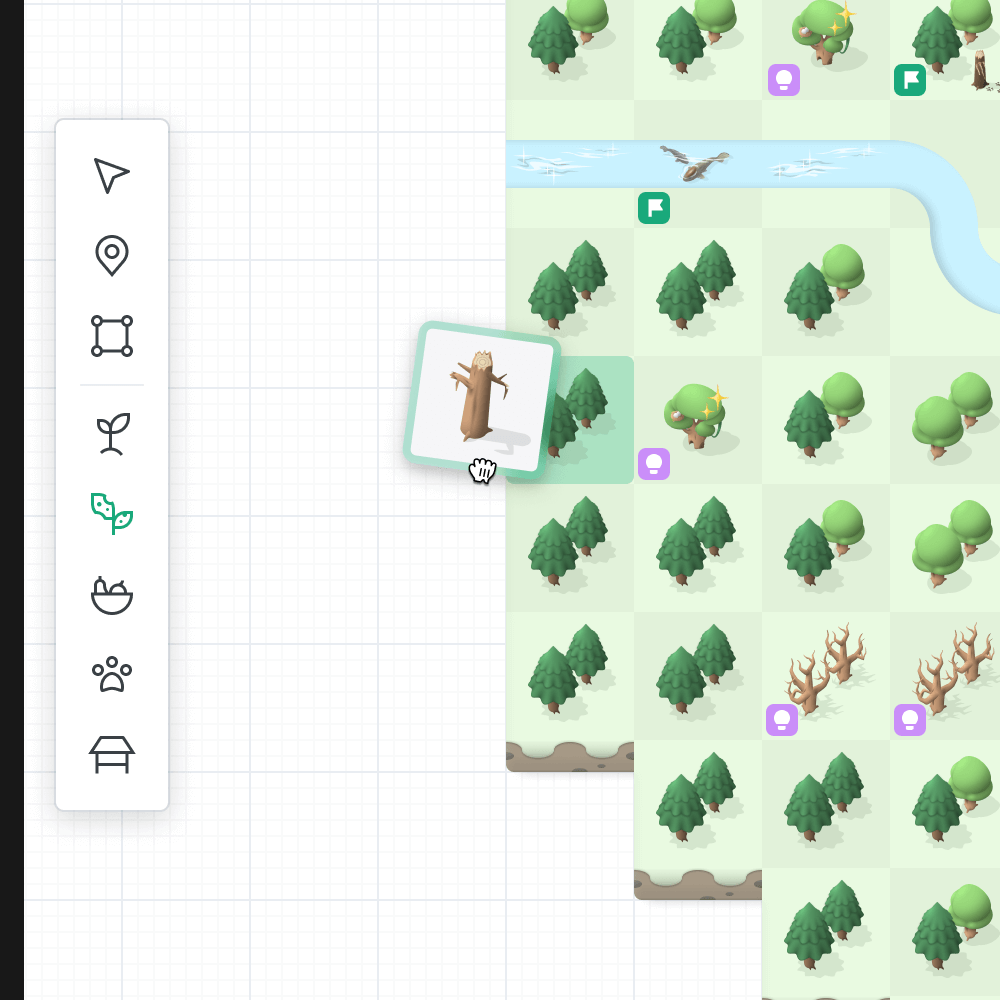
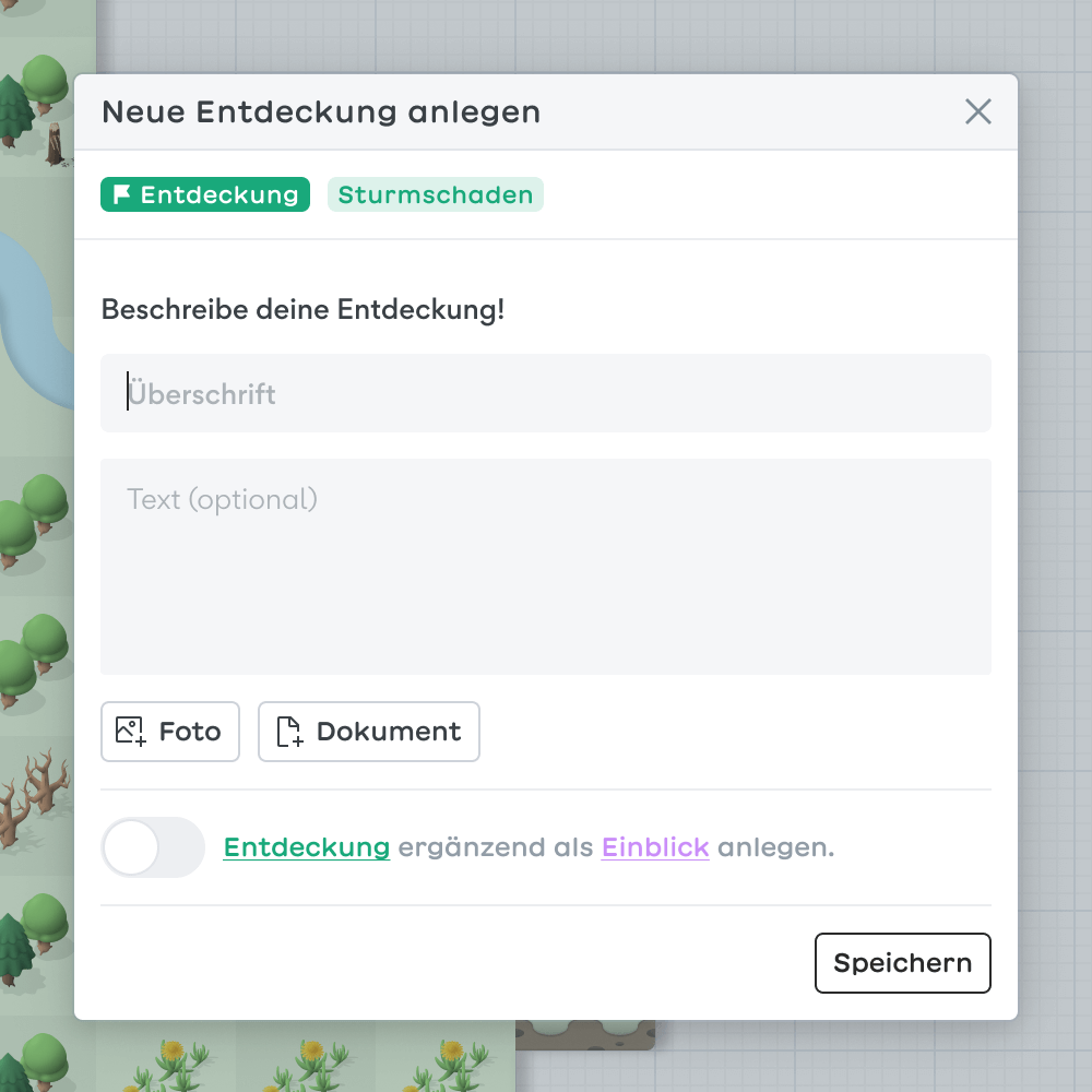
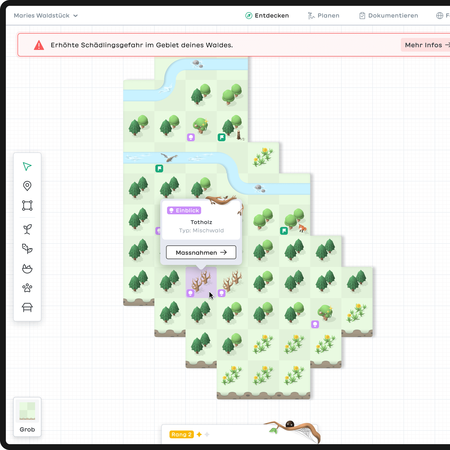
The outer areas of the square are reserved for the user's own discoveries. They reflect exciting events, objects and places users may encounter in their forest. Discoveries can be placed directly on the map using the toolbar and be customized with notes or attachments. Thus, they function like a spatial diary. All entries are also listed chronologically on the right side of the screen.
Insights
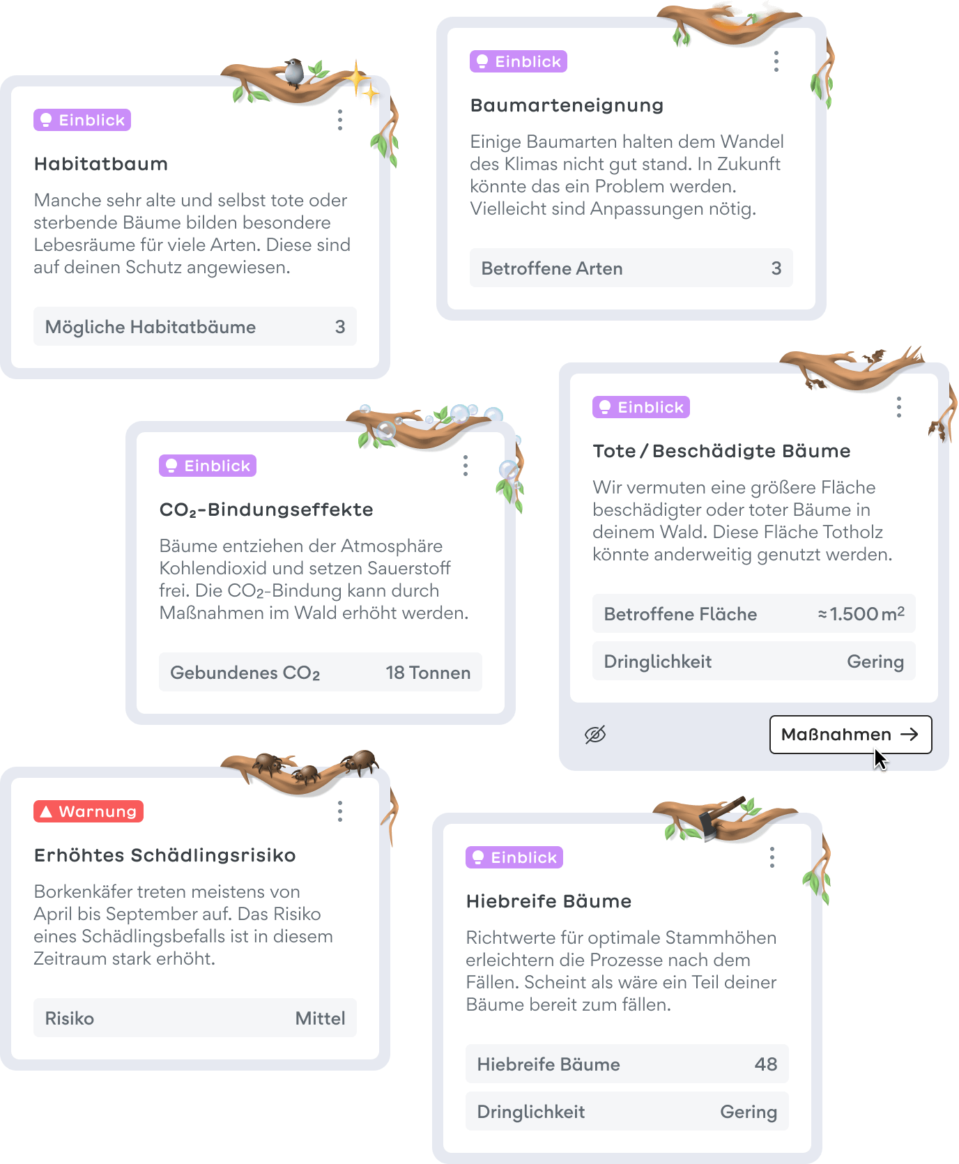
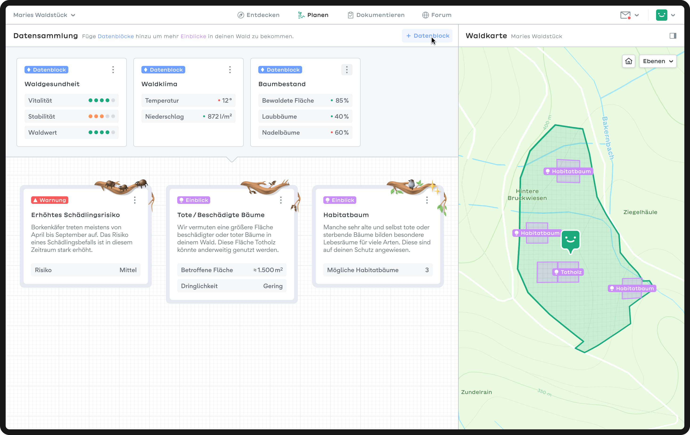
In addition to discoveries (green), there are also insights (pink). Unlike discoveries, they are not added to the map by the user but automatically by the software, based on satellite data. They show current developments in the forest, such as storm damage, dead trees or unsuitable tree species.
Color coding and matching illustrations help to quickly grasp the content and importance of the information presented. Each insight is assigned to the corresponding measures.
Quests
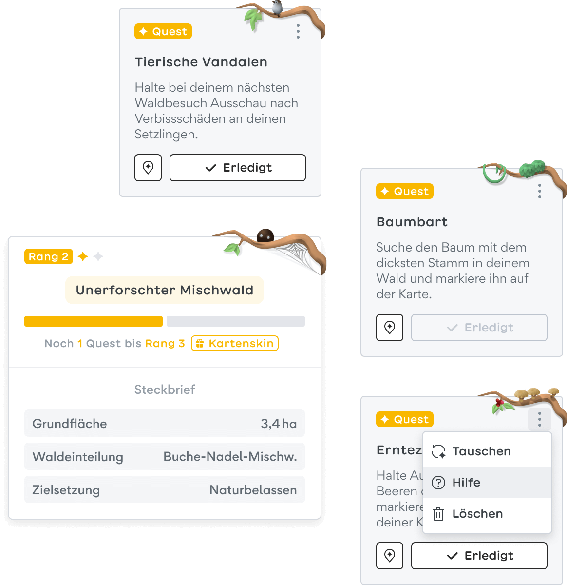
To motivate users to regularly visit the forest and maintain the application, we implemented aspects of gamification, such as quests and ranks. One possible quest is to look out for damages caused by wildlife and mark them on the map. By doing so, the software is fed with additional data in a playful way and the map becomes more and more accurate.
Main navigation
The main navigation reflects four consecutive work steps: Discover, plan, document and network. Different forest plots can be selected on the left. Each parcel has its own workspace. Via the chat dropdown, it's possible to contact other users.
Plan page
The visual language of the map changes once entering the planning screen, indicating that interventions in the forest have real consequences. In addition to a satellite view, there is a stylized map with different layers available. The map has a significantly greater depth of information and plays a supporting role in the planning process.
Data blocks
Data blocks form the foundation for generating insights. Each block combines different data types to provide specific information, such as forest health, tree population or tree heights. Advanced users can add more data blocks resulting in more detailed information and therefore more insights are generated.
Measures
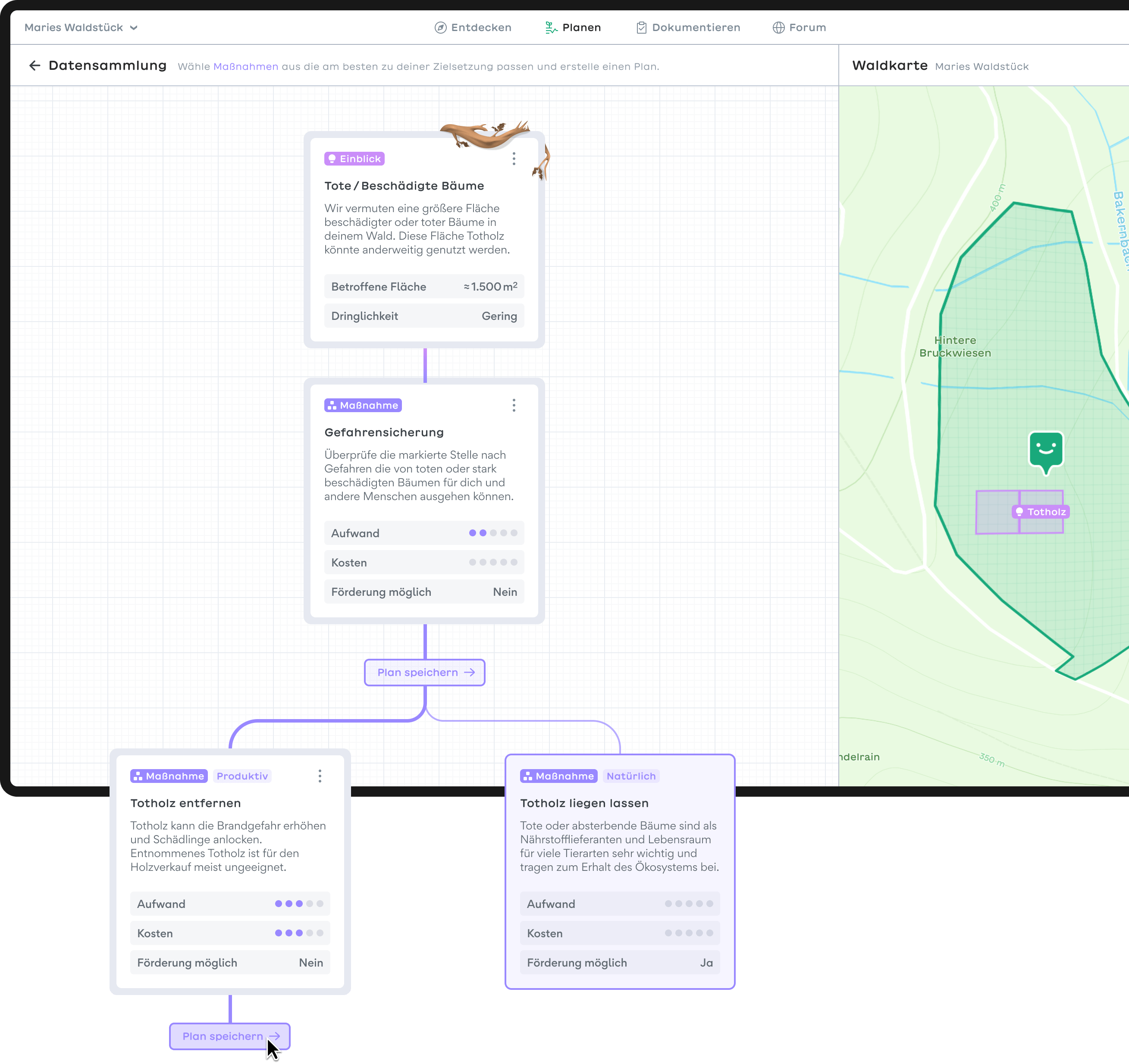
Measures ONLY exist in the context of insights. They provide users with effective ways to deal with positive, neutral or negative news. Since erroneous diagnoses can never be completely ruled out, users are advised to visit the forest to confirm the assumption - ideally accompanied by their trusted forester.
A measure usually leads to follow-up actions. Since there are user-specific ways for forest maintenance, different approaches to choose from are displayed: ecological (minimum interference with nature), productive (generating economic added value) and multifunctional (something inbetween). Various factors, such as effort, costs and financial support are compared in order to weigh the options.
Documentation page
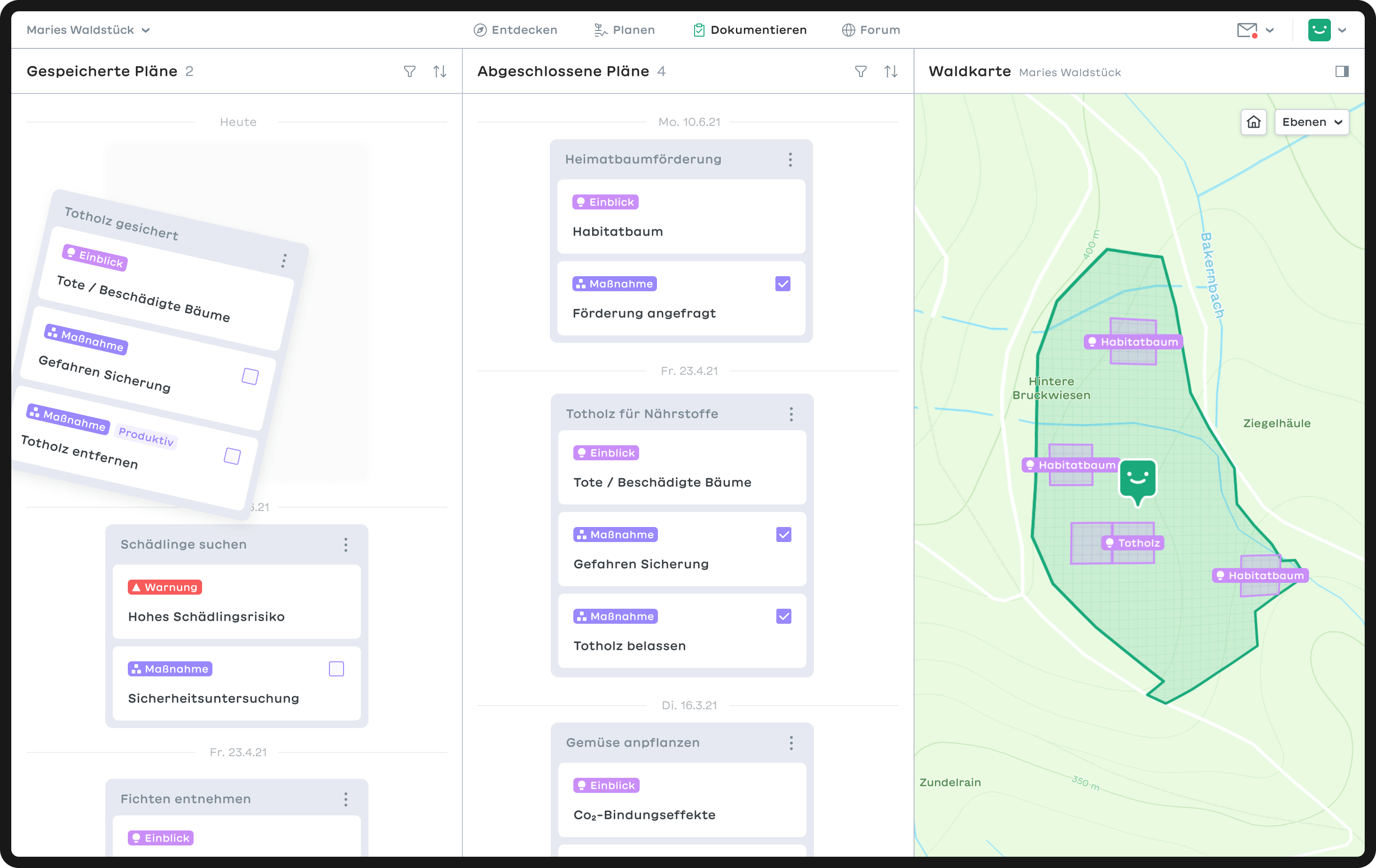
Each insight and measure-branch can be saved in the documentation. The documentation page is divided into three sections: Saved plans, completed plans and a map. Selected plans are shown on the map. This way users have the possibility to also locate completed projects.
Plans
In order to save space and reduce complexity, plans are summarized in smaller stacks. They can be unfolded to view details of the related measures and insights. Since one goal was to make forest care more attractive and to reward forest owners for their contribution, possible fundings are shown at this point.
Forum page
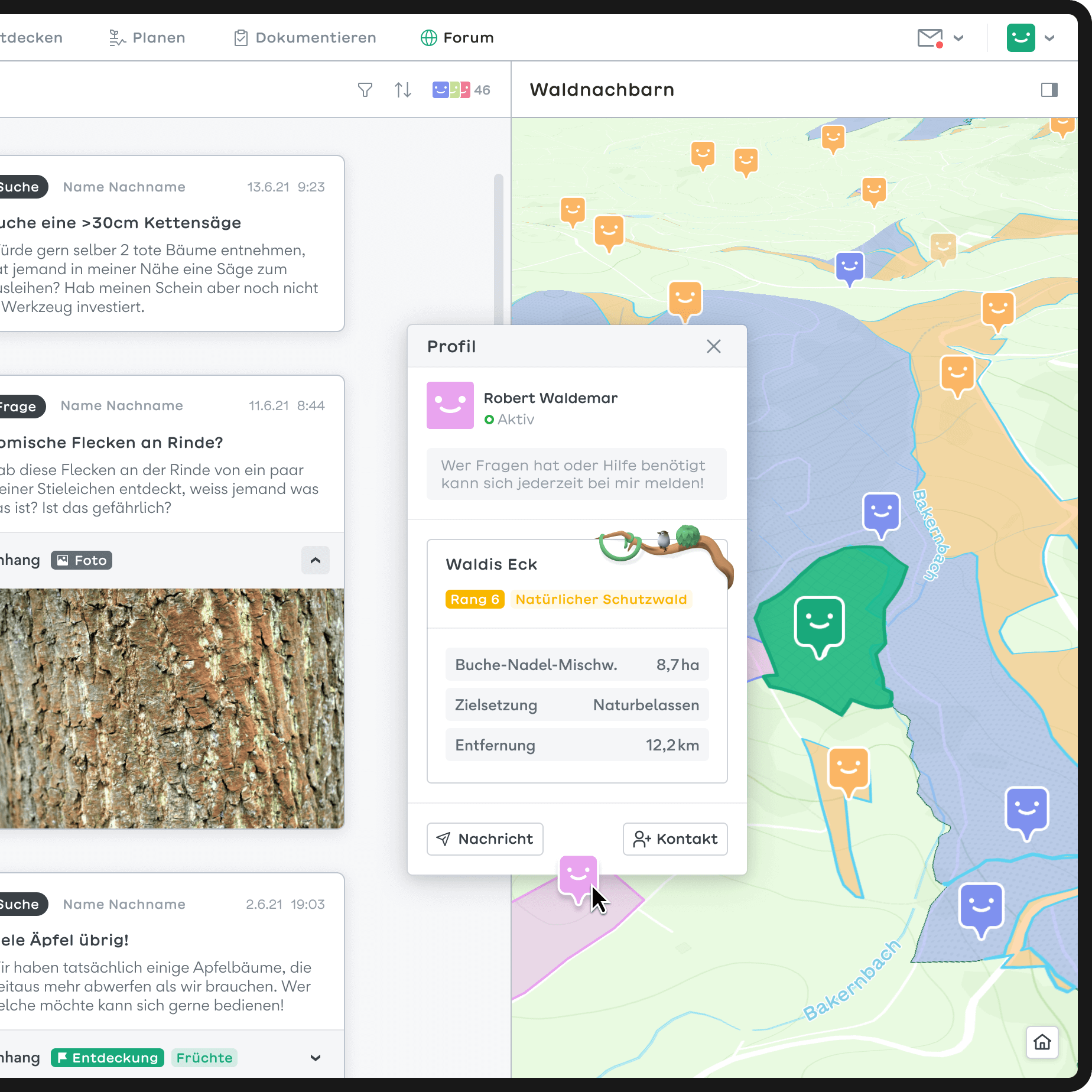
Proper forest management requires expertise and equipment. By integrating a forum, we intended to connect neighboring forest owners to share experiences and equipment or even organize joint work.
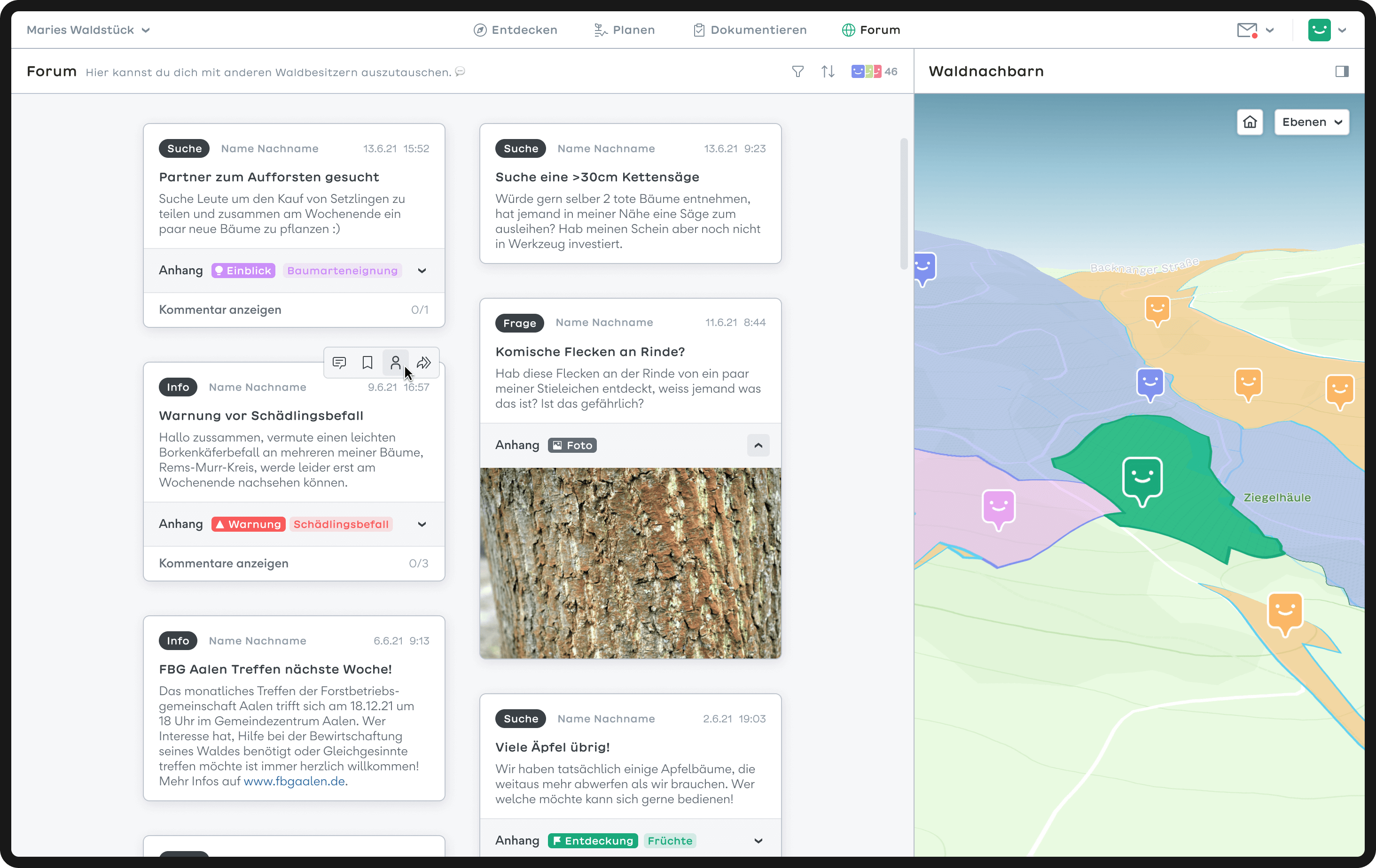
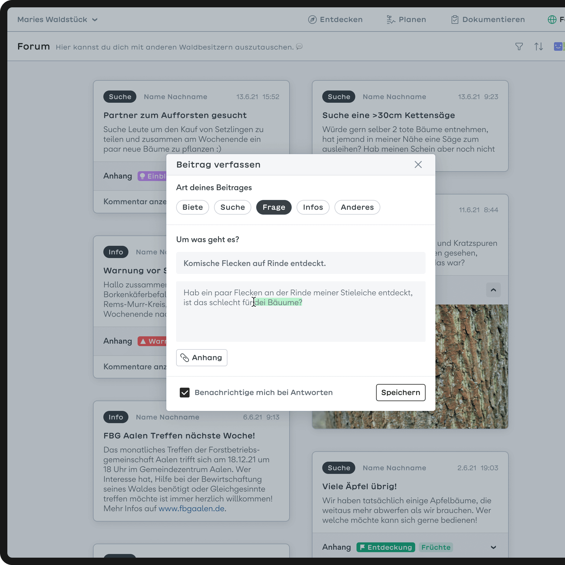
The community page takes up the idea of a bulletin board. It allows users to interact through posts. Others can comment, bookmark or forward posts. The community map allows users to search for like-minded people in their immediate surroundings.
Smartphone app
The smartphone is ideal for keeping an eye on your property anytime and anywhere. Data can be recorded manually via the camera. For example, meassuring trunk diameters or identifying unknown species. While user learn more about their forest, the software is fed additional data thanks to gps and image recognition.
