Casper

Smart body scale operated by foot, to enable instant insights - no app needed

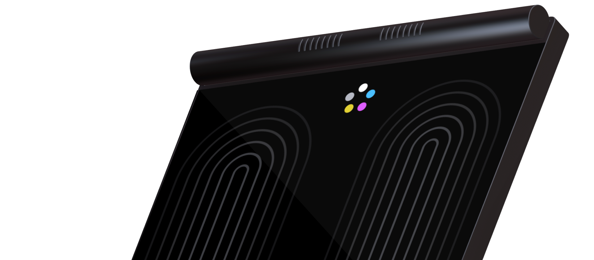
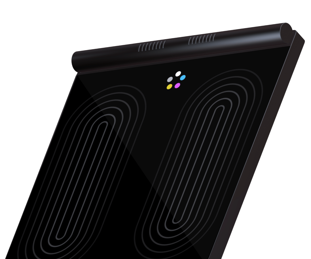
The image shows a 3D model of a body composition scale. It is floating in front of a black background with only the upper half visible. On top of the screen, there is a logo, with five differently colored circles that are arranged like flower petals. Large, subtle lines frame the area where the user is supposed to stand.

In this project, I set out to rethink the way we interact with body composition scales, addressing a key limitation in many existing products: the reliance on external apps to access detailed insights. The concept integrates a full touch-screen surface on the scale to make body composition data instantly accessible. The motivation behind this, was to challenge myself to design an intuitive UI that is operated by foot without compromising functionality. This required inventing new interaction patterns to minimize the number of steps involved, ensuring a smooth, efficient experience.

Client/Setting

Personal project

Role

Research, Ideation, UX, UI, Prototype, Testing, Illustration

Tools

Figma, Figjam, Adobe Illustrator

Team

-

Redesign my own redesign

When I started my studies, my teammates and I designed the interface for a body analysis scale. After graduating, I decided to tackle the project again with my expanded knowledge. I assumed that a few visual tweaks would do the trick. I flooded the interface with all the functions that were technically feasible.

After testing my design with friends and family I realized: My approach was more self-centered than user-centered. It was time to throw all assumptions overboard and start from scratch.
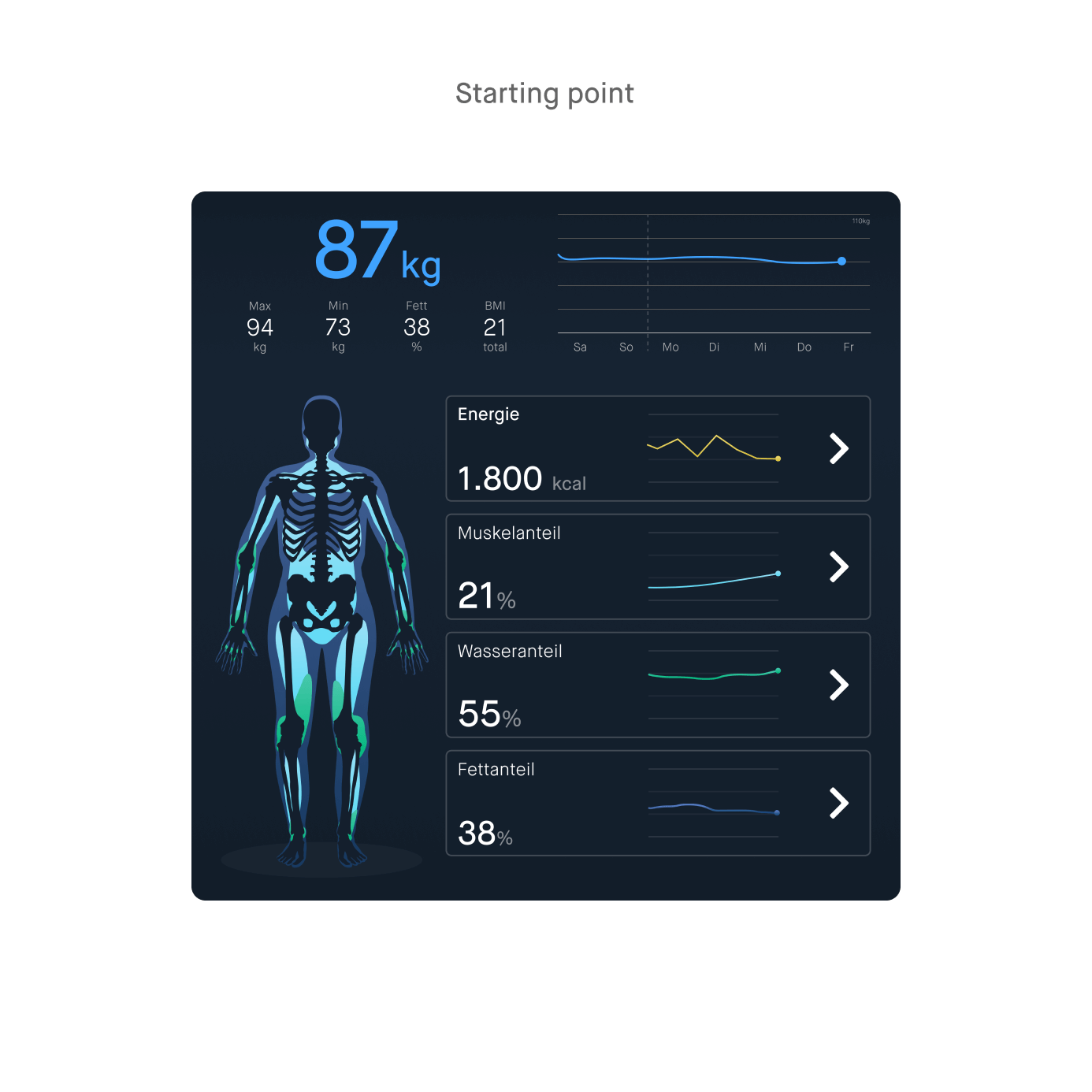
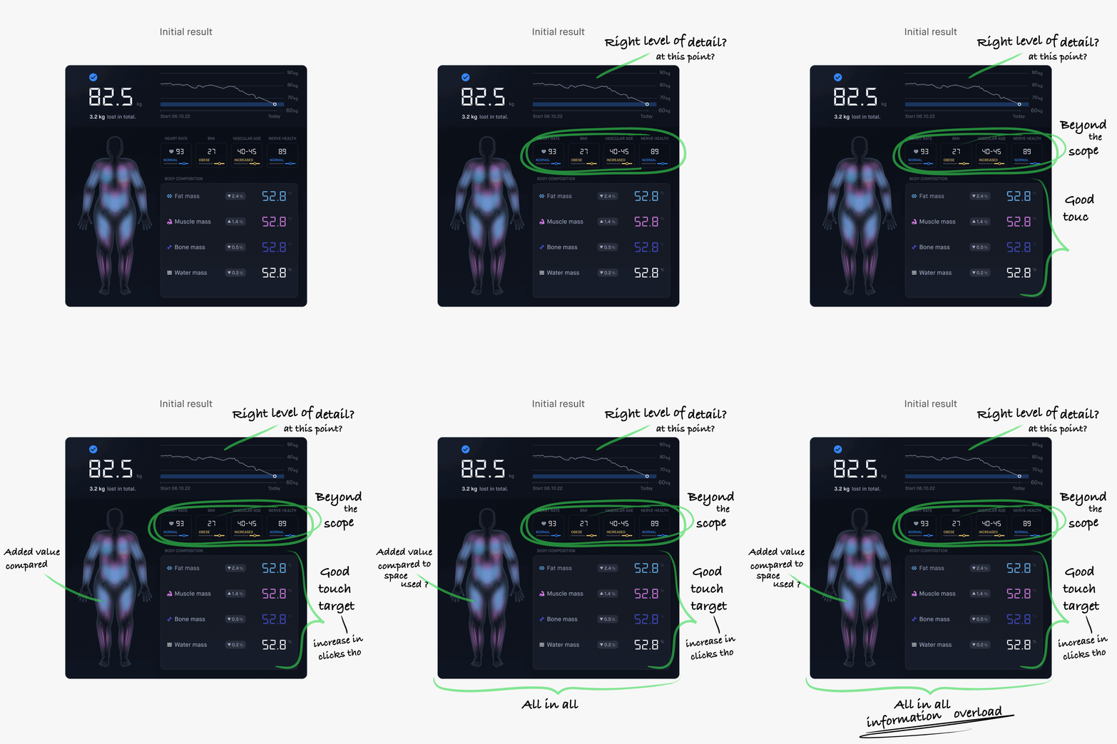
Two user interfaces are displayed side by side. The one on the left shows the starting point, featuring weight data and a weight trend graph. Below that is a diagram of the human body, with different body components marked in various colors. Next to it, four elongated cards are arranged vertically, providing information about the body components. The image on the right shows a revised version of the UI. It has a similar layout but includes additional health data visualizations. Handwritten comments are placed around the UI for feedback.

Who are the users?

The product is primarily aimed at fitness and health enthusiasts who are passionate about tracking their progress and getting detailed insights. They are tech-savvy and willing to invest in tools that support their goals. The main focus group is athletes and young adults. However, the product is designed to also cater to older or less tech-savvy people.
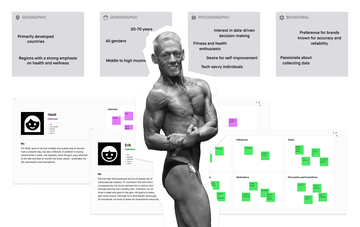
The image shows a collection of information about the target audience and personas. In the center, there is a black-and-white photo of an older bodybuilder posing. Above the photo, four tiles are arranged, gathering geographical, demographic, and psychographic characteristics, as well as behavioral patterns of the target audience. At the bottom of the image, partially covered by the person, two personas are displayed.

Project goals

  • Seamless multi-user experience
  • Provide instant insights without the need for an app
  • Promote a healthy body image with neutral data presentation
  • Foster user motivation and engagement through progress

Finding the functions

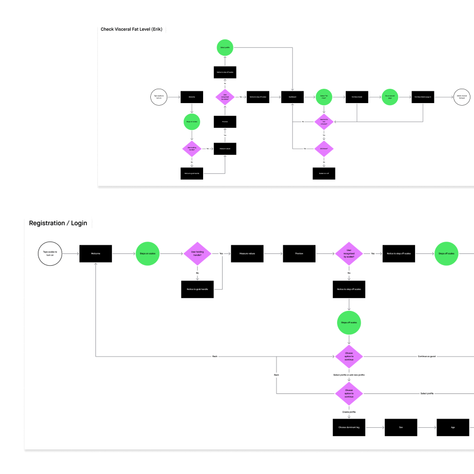
I gathered all the parameters that are possible to measure according to similar existing products and the current state of technology. In the next step, I categorized the parameters according to relevance in order to finally find the perfect range of functions for the users' needs. Once the feature set was defined, I developed an information architecture and created user flows to guide the design process.
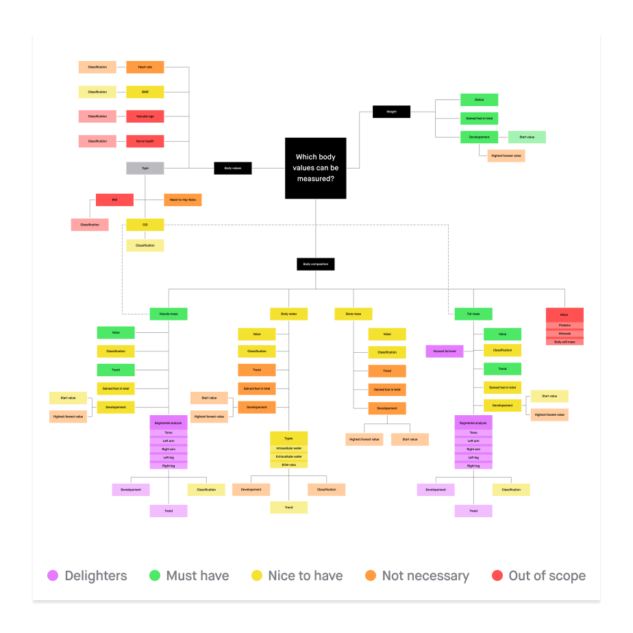
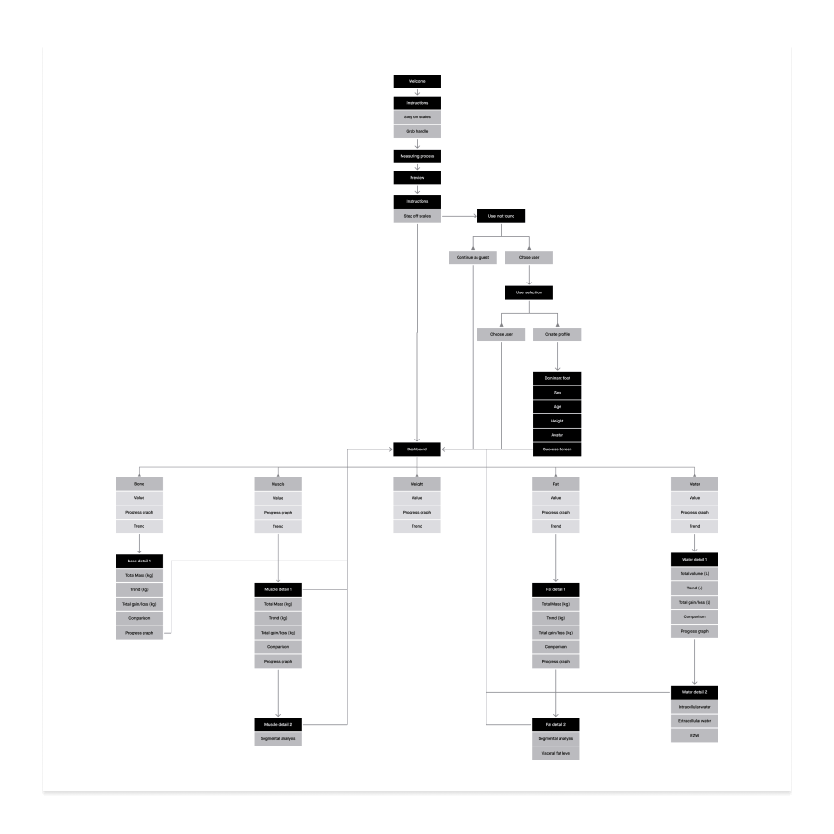
A series of three images. The first image shows a colorful mind map with a collection of features for the scale. There are five different colors in total. Below the mind map is a legend explaining the colors. Depending on the color, the feature is classified as a must-have, out of scope, or somewhere in between. The second image shows the information architecture of the interface. Finally, the third image displays two user flows.

Touch target

Once the information architecture was finalized, I created the first rough wireframes. Since the scale's touchscreen is operated with the feet, I couldn’t rely on conventional hand gestures and UI elements. The touch targets had to be significantly larger to ensure smooth foot-based interaction. In addition, the distance between the user's eyes and the screen had to be taken into account. UI elements must be easily recognizable even from a distance. Using life-size prototypes, I tested the usability of different layouts and readability of text sizes to refine the design.
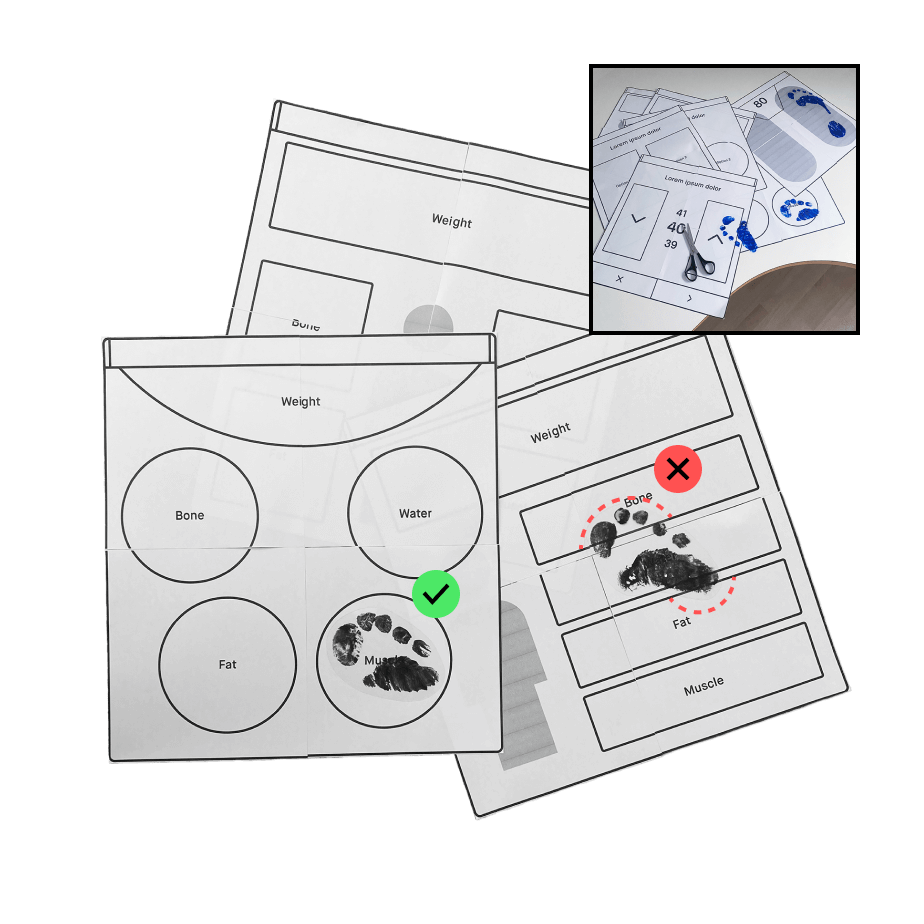
The image shows three square printouts of different interface layouts. They are arranged randomly, some overlapping. Two footprints are visible, each positioned on a button of the scale. One footprint is marked with a green checkmark, while the other has a red cross. Additionally, the area where the footprint overlaps into another button is highlighted in red. In the top right corner, there is a small photo of a desk with more printouts scattered on it.

Navigation

The top and bottom areas of the screen are used for forward and backward navigation. This design ensures high accuracy and makes the buttons easily accessible for users, regardless of whether they have a dominant right or left leg. If steps with selection options are displayed on several screens, the forward navigation buttons disappear. After an input action and a short period of inactivity, the user is automatically forwarded to the next screen. This saves steps and reduces the risk of accidental selections.
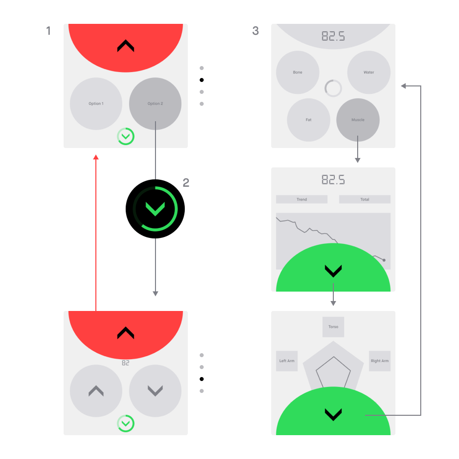
The image shows multiple wireframes of the scale, illustrating the navigation structure. The wireframes are connected by arrows. Some of the wireframes have a red or green semi-circular area at the top, indicating forward or backward navigation.

Visual design and Design System

The visual design is a modern take on the classic dot-matrix display, similar to those seen on old alarm clocks, to reflect the medical context and keep the user's focus on the essentials. The dark surfaces and minimalist style ensure energy-efficient usage and prevent users from being blinded in low-light conditions. In order to not boost an unhealthy body image, one key design requirement was to present the data in a neutral way. This is also reflected in the color scheme — red and green, typically used to indicate positive or negative changes, were intentionally avoided when displaying progress.
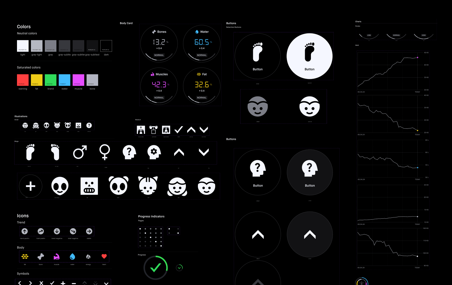
The image shows a collection of UI components with a dark appearance. The icons are white and characterized by very simple, almost rough shapes. Additionally, elements such as buttons, cards, and charts are displayed.
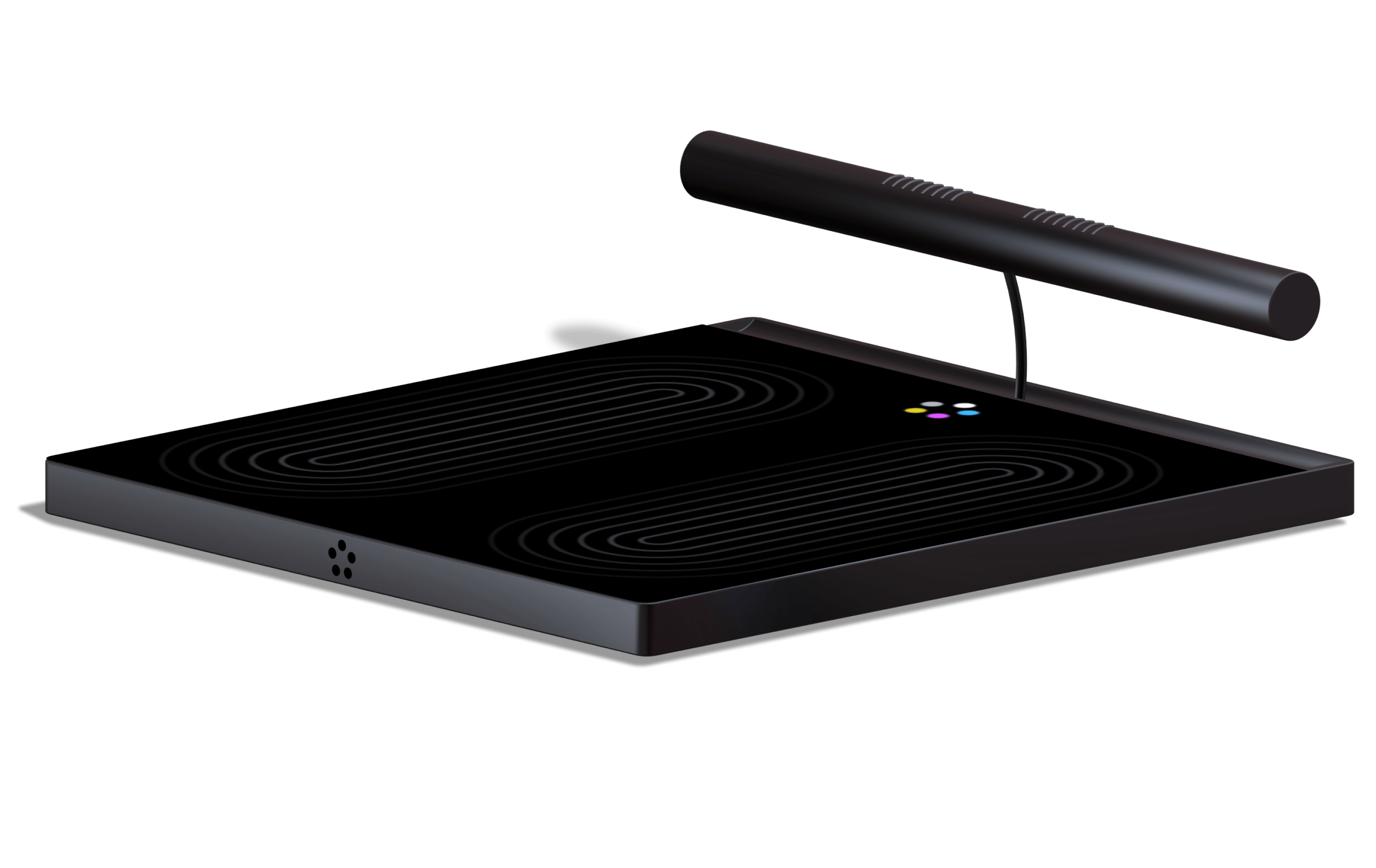
The image shows a 3D representation of the scale. It is square and made of dark material. On the screen of the scale, two oval shapes are visible, indicating where users should position themselves for weighing. Above these is the logo of the scale, consisting of three differently colored circles arranged in a flower-like pattern. At the top of the scale, a cylindrical handle hovers, connected to the scale by a cable.

Hardware

The handle contains the electrodes needed for recording a 6-lead ECG, ensuring more accurate measurements. Functions that are used less frequently, such as deleting a user profile or pairing with a smartphone, can be accessed via the settings button. This keeps the main screen focused on the essential information.
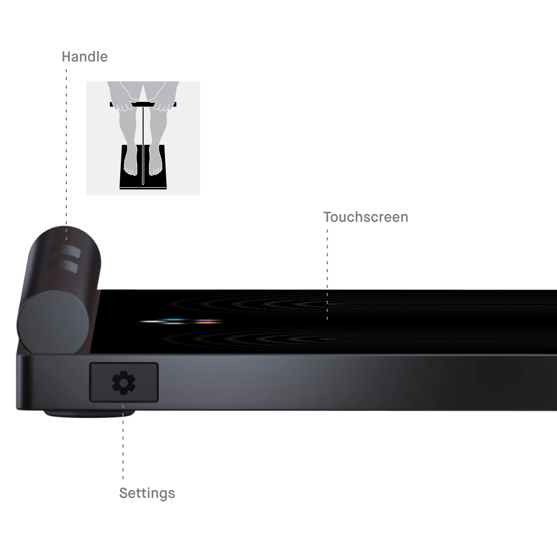
The image shows a 3D side view of the scale. A black button with a settings symbol and the label Settings is embedded in the metal housing of the scale. The handle is also labeled and accompanied by an illustration showing a person standing on the scale, holding the handle.

Create profile

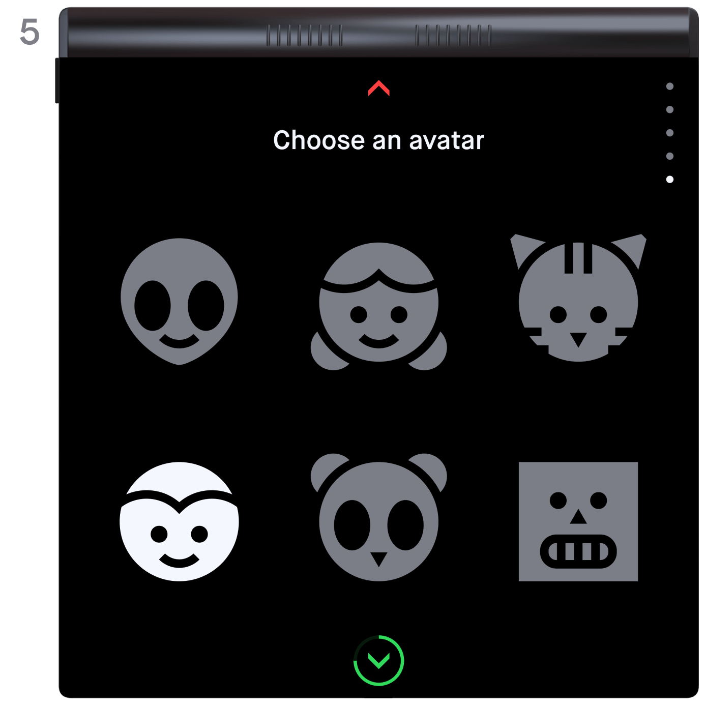
When the scale is turned on for the first time, the user is instructed to create a profile. Depending on which leg the user specifies as the dominant leg, the layout of the interface changes to minimize the distance for interactions. Information such as age, gender and height is required in order to better classify the measurement data.
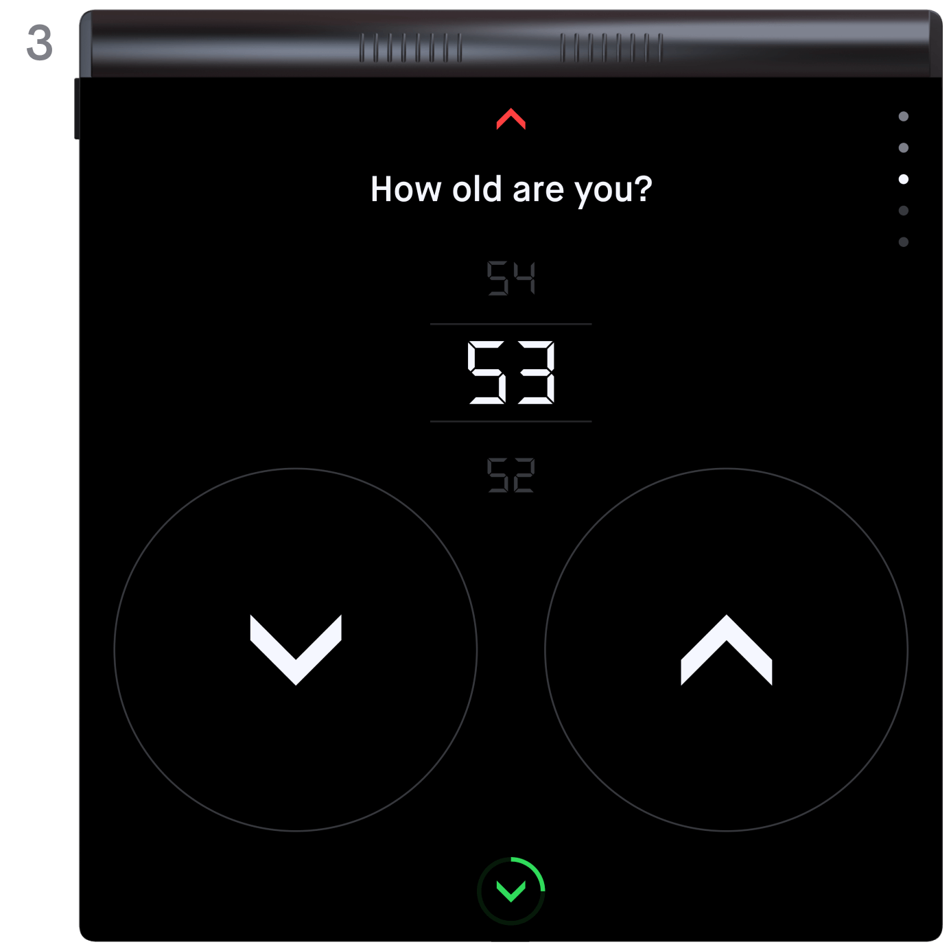
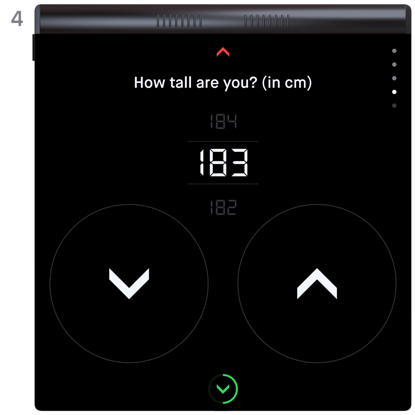
A series of three images. Each image shows the scale from above, displaying the last three steps in the profile creation process. The first image presents the question about the user's age, with three numbers arranged vertically. The middle number is highlighted and larger than the others. Below the numbers, there are two large circular buttons, each with an upward and downward arrow. The second image features a screen set up similarly to the first, but this time it asks for the user's height. In the final screen, the user is prompted to choose an avatar from six different emoticons.

Onboarding

The start screen initiates the measurement process. Subtle animations encourage the user to interact with the scale (1). After a few seconds of inactivity, animated icons appear to guide the user though the measurement(2; 5). This is especially helpful for first-time users. If the user remains inactive for an extended period, the scale automatically turns off.

Measurement

For experienced users, the measurement process is much quicker. After activating the scale with a tap, they step on and grab the handle. The scale automatically identifies the user based on their body metrics, ensuring that the correct progress data is displayed on the dashboard.

Dashboard

While the user stands on the scale, only a small preview is displayed. Once they step off, all measurements are shown. Weight is prominently placed at the top, indicating that the four values below it contribute to the total weight. A ring chart in the center visualizes the distribution. Each "bubble" is clickable and shows a preview with the most important information. The two most relevant categories, muscle mass and fat mass, are positioned at the bottom of the screen for easier access, as they are likely to be clicked more frequently.
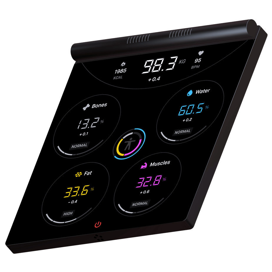
The image shows a perspective view of the scale. On the screen, the following information is displayed: at the top of the screen, there is a semi-circle that shows the weight, pulse, and calorie count. In the center of the screen, two ring diagrams are presented. One of the ring diagrams indicates the percentage of water content in the body, while the other uses four colors to display the proportions of other body components. Surrounding the ring diagrams are circular tiles that represent data on bone mass, water mass, fat percentage, and muscle mass. The values in the tiles are color-coded to match the colors used in the ring diagram.

First detail level

By clicking on a category, the user "dives into the bubble" to access detailed information. The same navigation principle applies here: with each click at the bottom of the screen, the user delves deeper into more detailed levels, eventually returning to the main dashboard.
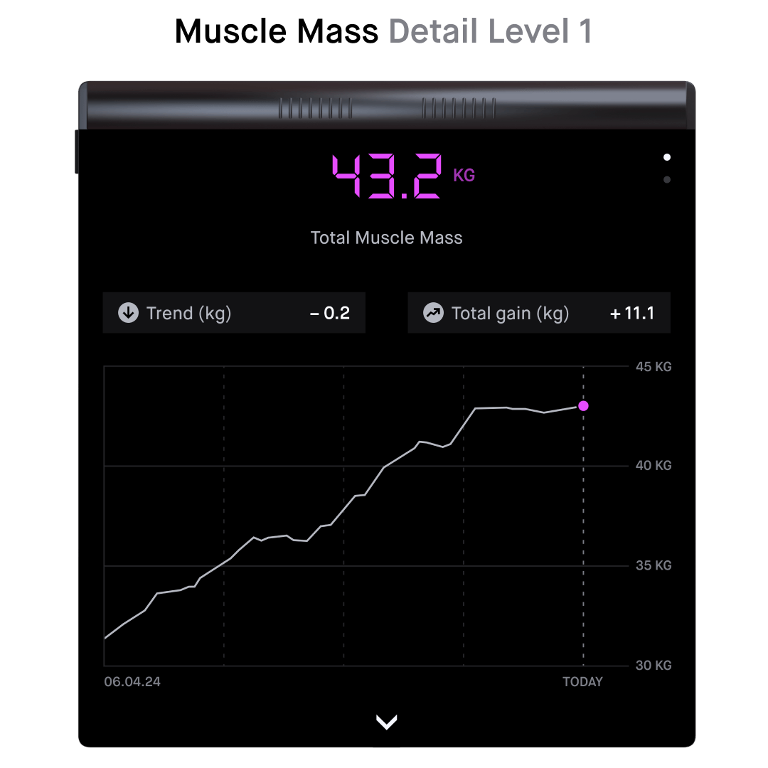
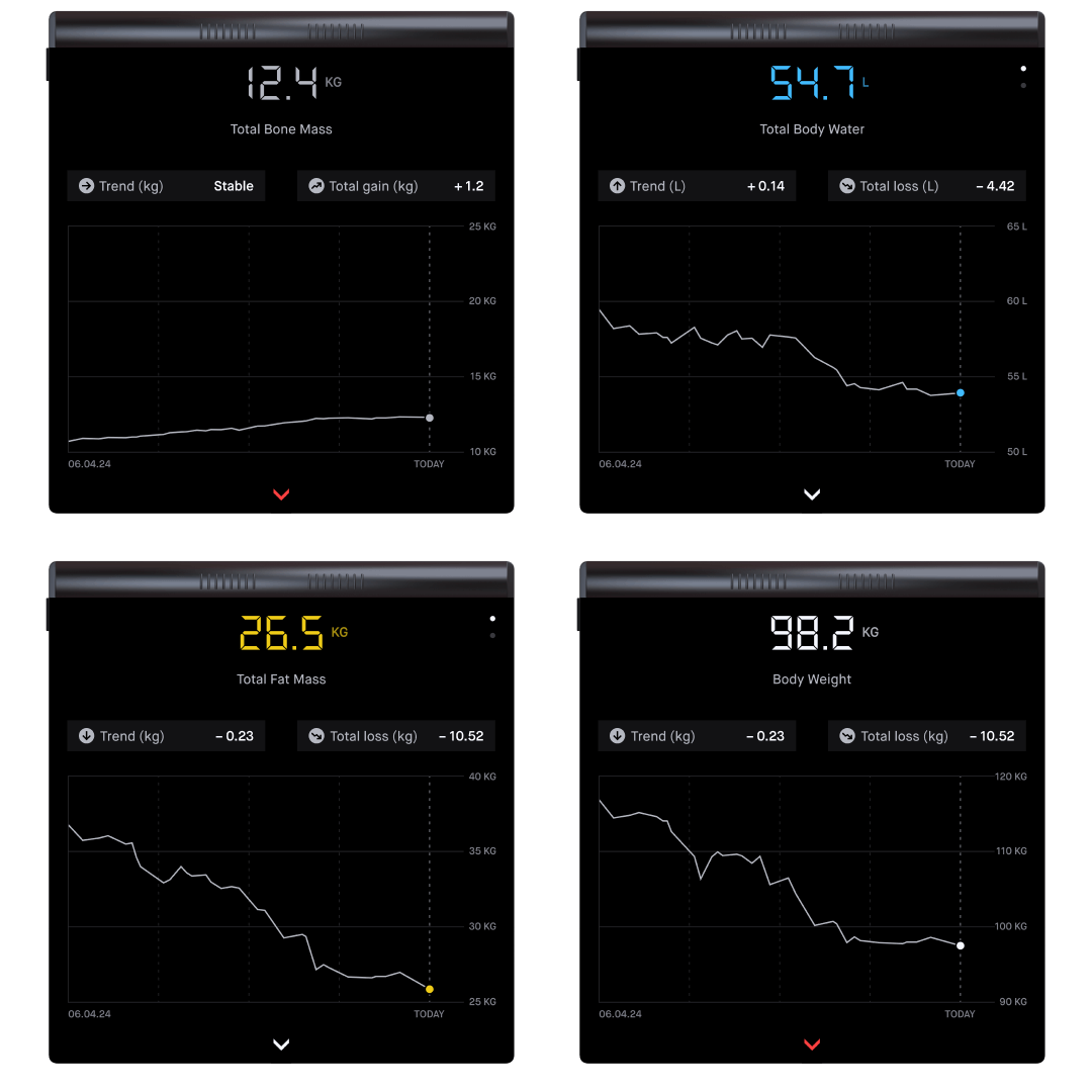
Several mockups of the scale are positioned side by side. They show the first detail level of the various body components. They are all similarly structured and differ only in the data and color schemes.

Second detail level

The first detail level visualizes progress. The categories muscle mass, fat mass, and water volume have an additional level, where the precise distribution in the body can be viewed. The challenge was to present the data as simple as possible without compromising its informative value.
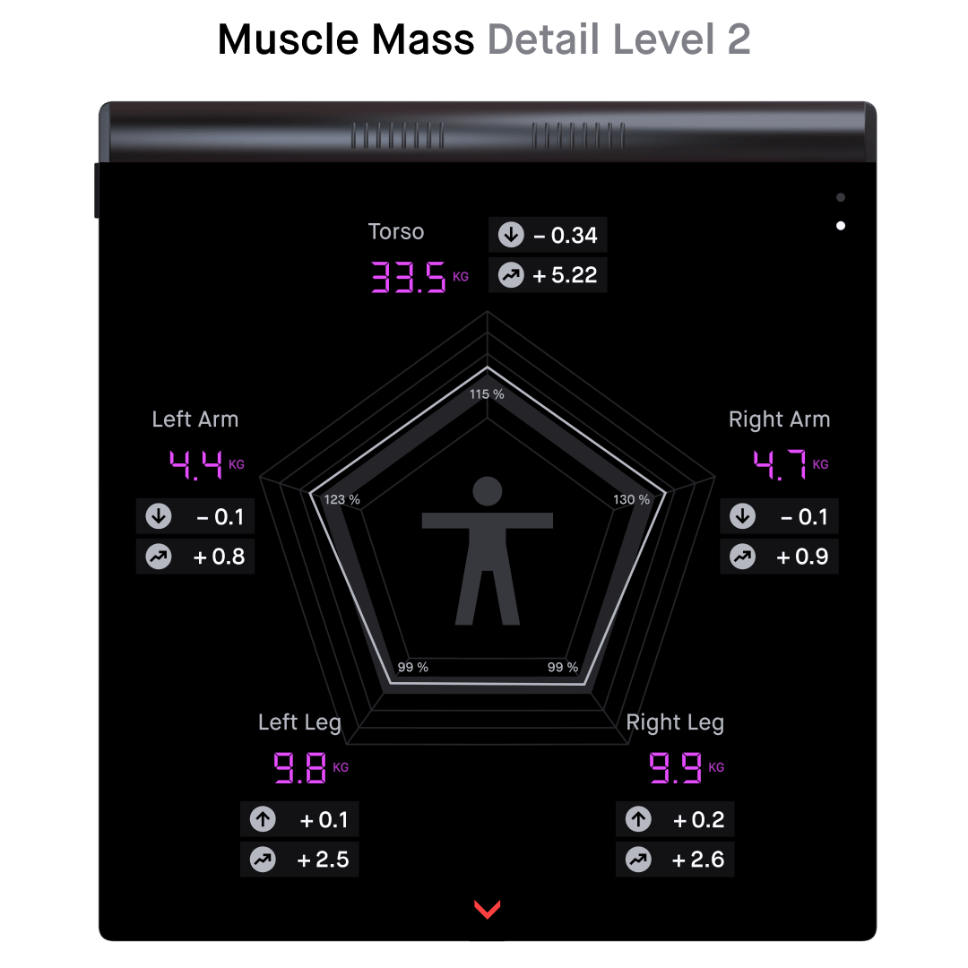
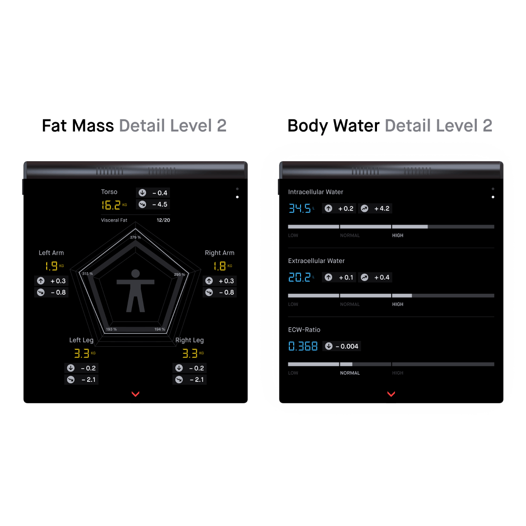
Several mockups of the scale are positioned side by side. They display the second detail level of the various body components.

Unknown User

Up to six profiles can be added. If an unknown person steps on the scale, they have the option to proceed as a guest (without a profile) or create a new profile. If the scale is uncertain in identifying an existing user, the user can manually select their avatar, which was set during the registration process.
You have reached the end

But there is plenty more to see.