VR-Banking

Reimagining banking: A user-centric redesign for seamless financial management

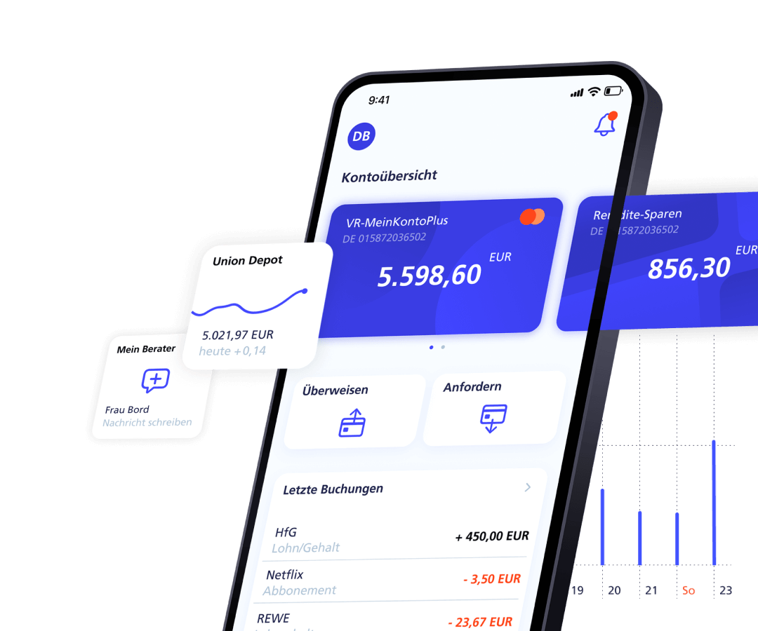
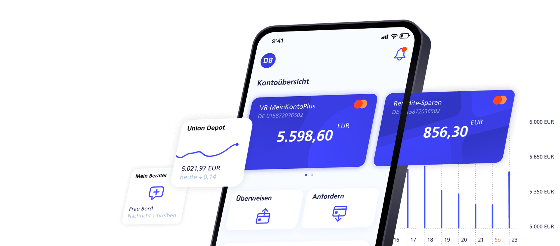
The image shows a smartphone mockup. Several cards are visible on the screen, with a bar chart featuring thin, narrow bars in the background. Additional cards are floating around the mockup.

This app concept was created during my studies. It focuses on the redesign of a well-known banking app to enhance usability and introduce new features, ensuring competitiveness in the market. The main goal was to simplify navigation, enabling users to access services and execute tasks more quickly. Alongside these functional improvements, the app received a modern visual update that aligns with the brand's corporate identity, ensuring it continues to convey trust and reliability to its users.

Client/Setting

Uni project

Role

Research, Ideation, Concept, UX, UI, Prototype

Tools

Figma, Adobe Illustrator, Principle

Team

Michael Mack, Katja Rößler

Background and objectives

The image below shows screenshots of the 2019 app version (since updated). We chose to redesign this app since we were users ourselves and did not enjoy the overall experience. After identifying its strengths and weaknesses and comparing them to similar apps, we aimed to improve its visual design and user experience while maintaining its core identity.
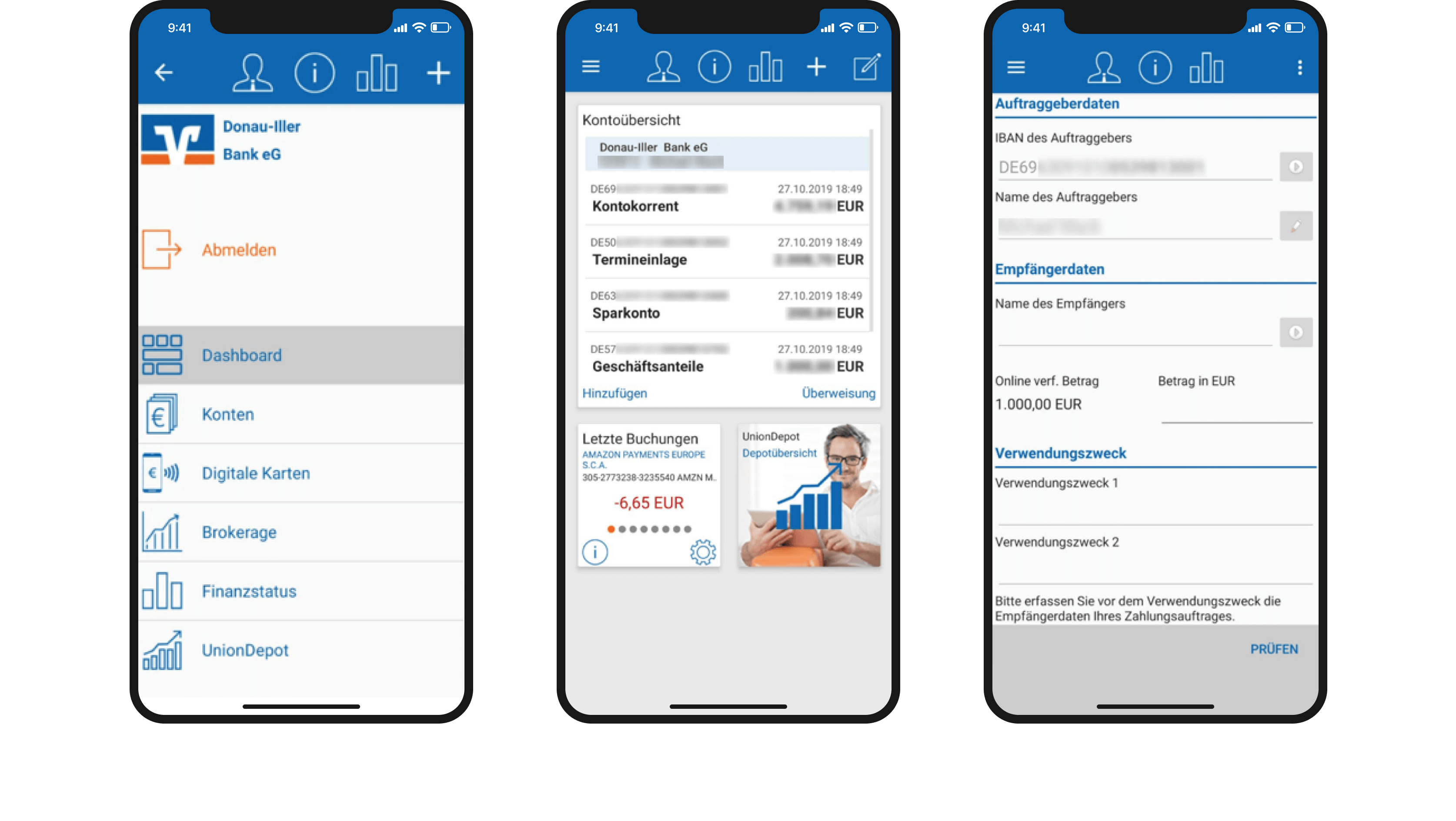
The image shows three smartphone mockups arranged horizontally side by side. The screens display screenshots of the original banking app. The first screen shows the login, the second shows the user’s dashboard, and the third displays the money transfer form.

Target groups, personas and user stories

The target audience is broad, as these apps can be used by virtually any adult. To address a wide range of user needs, we developed two distinct personas: David, a young adult, and Marvin, an adult in mid-life. These personas were selected to represent a diverse user base. After discussions with the personas, we crafted user stories to guide the design process and ensure the app meets the needs of both groups effectively.
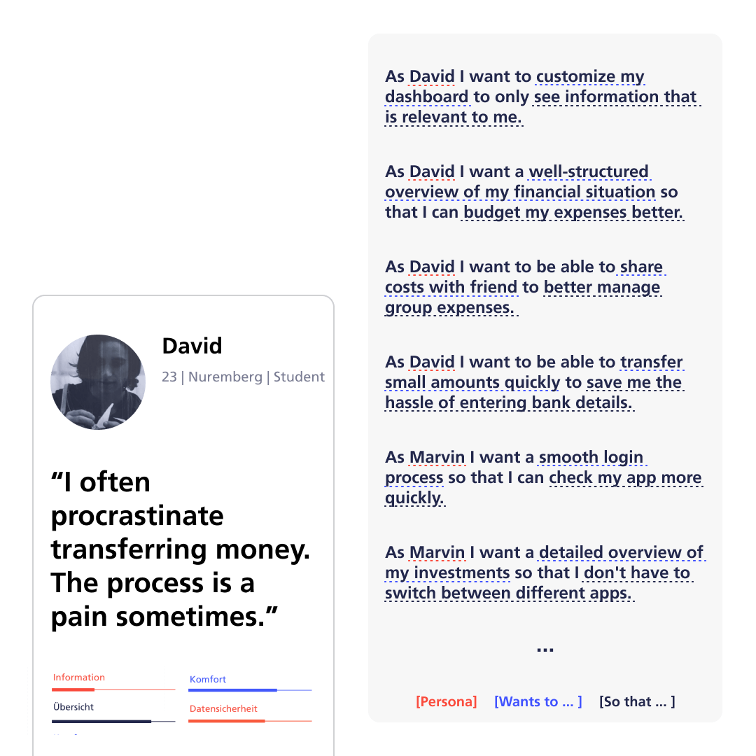
The image presents information about the persona David. He is 23 years old, a student, and lives in Nuremberg. In a quote, he says that he often postpones money transfers because he finds the process tedious. Next to the persona information, six user stories are listed vertically.

Interaction journey

We conducted Interaction Journeys with our personas by assigning them various tasks to identify typical usage patterns. This allowed us to observe how users currently navigate the app and uncover weaknesses in the app that may have been overlooked in direct discussions with users.
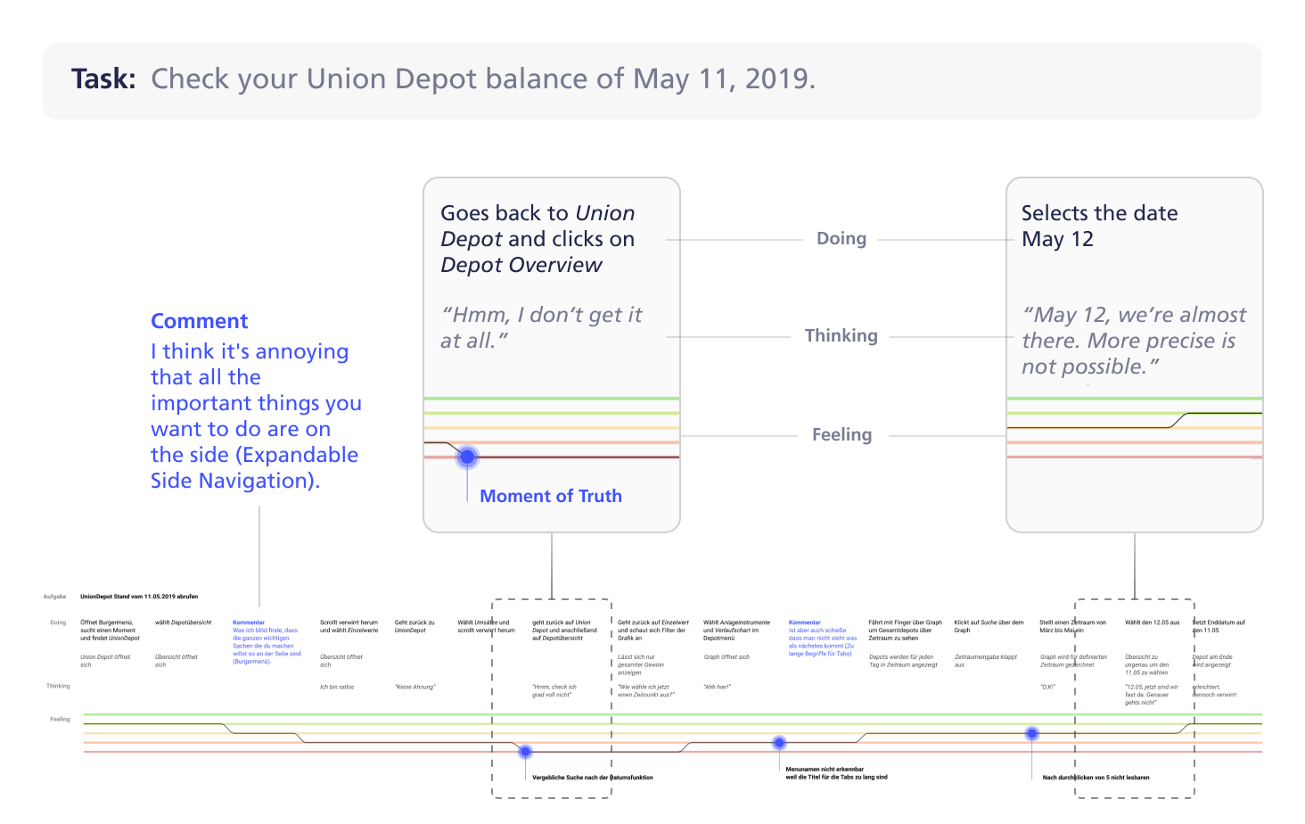
The image shows an excerpt from an interaction journey. The task states that the user needed to check the status of their portfolio as of 11.05.2019. A comment and two significant points during the interaction journey are highlighted.

Key findings

  • High density of information causing unclear structures and overstimulation
  • Confusing navigation due to various menus
  • Misleading wording/icons and unclear functions
  • Outdated visual design

Information architecture and wireflows

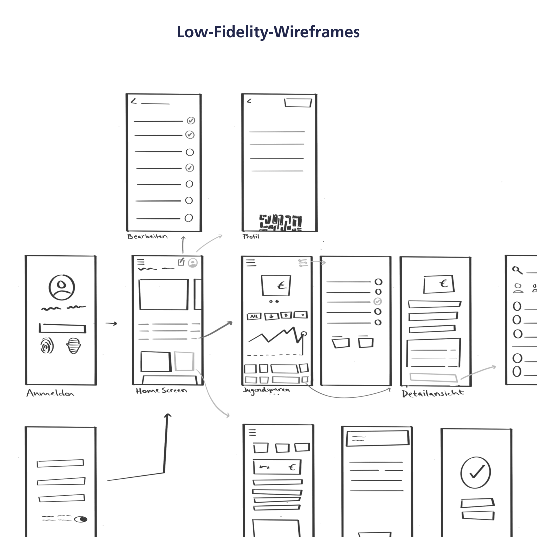
Based on the insights gathered, we developed a new information architecture, fundamentally redesigning the navigation structure. Through several stages, we created and refined wireframes, gradually improving them to arrive at the final design.
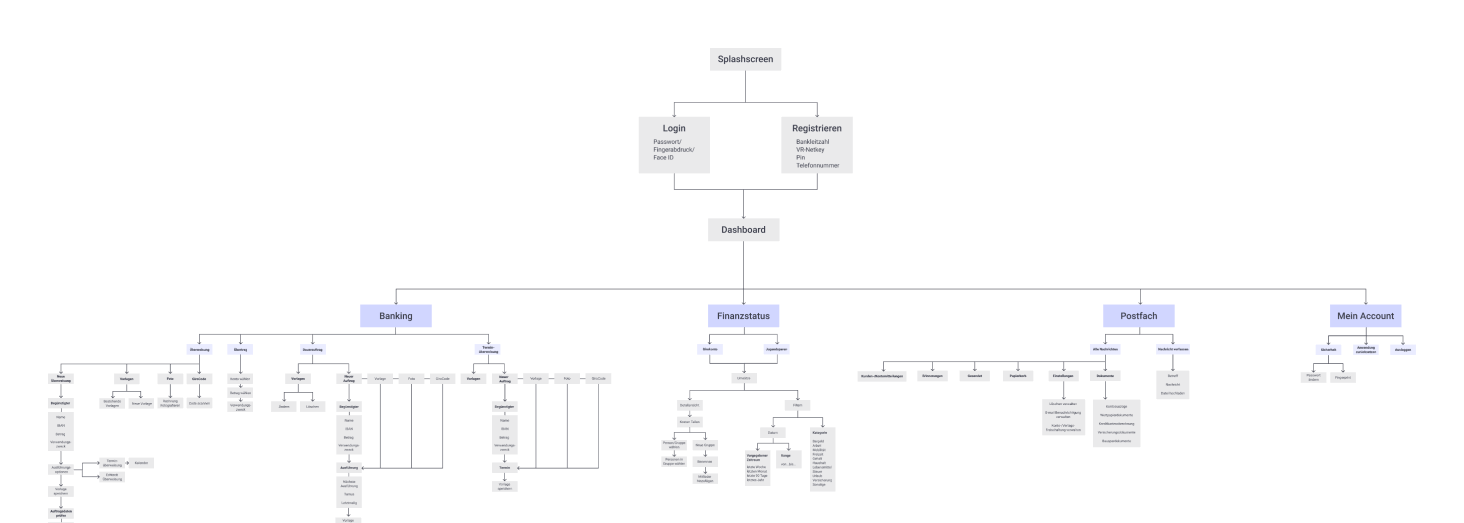
The image shows the information architecture of the app. It is divided into four main sections: Banking, Financial Status, Inbox, and My Account. Each section is further divided into several subcategories.
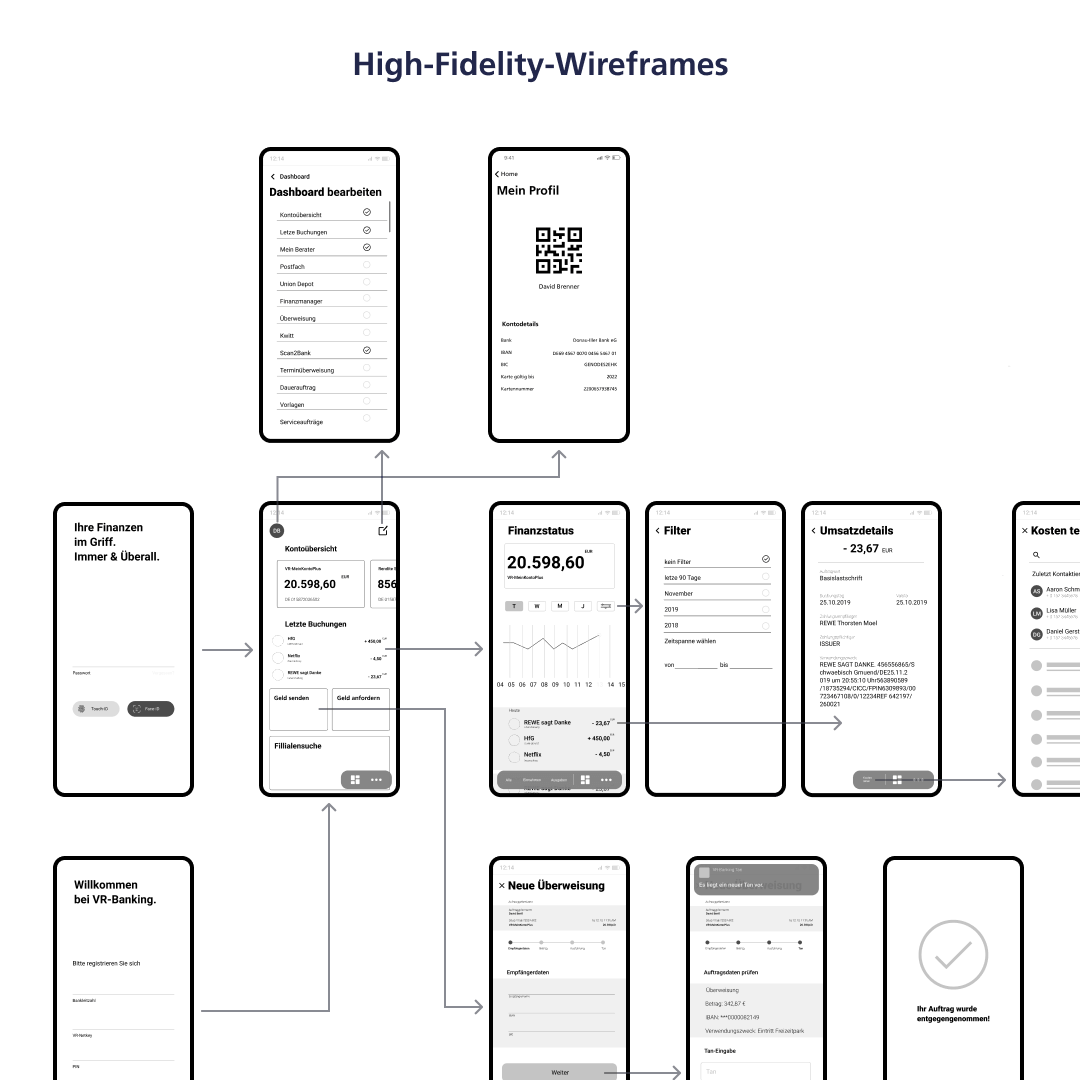
Two images are side by side, comparing low-fidelity wireframes on the left and high-fidelity wireframes on the right. From hand-drawn sketches on the left to detailed wireframes. The screens on both sides are connected with arrows.

Navigation

We identified the complexity of the navigation as a major weakness of the original app. To help users navigate, we got rid of the top navigation and categorized the functions. In order to only display relevant options we decided on a floating menu bar, with the actions to the left of the dividing line adapting according to whats shown on the screen.
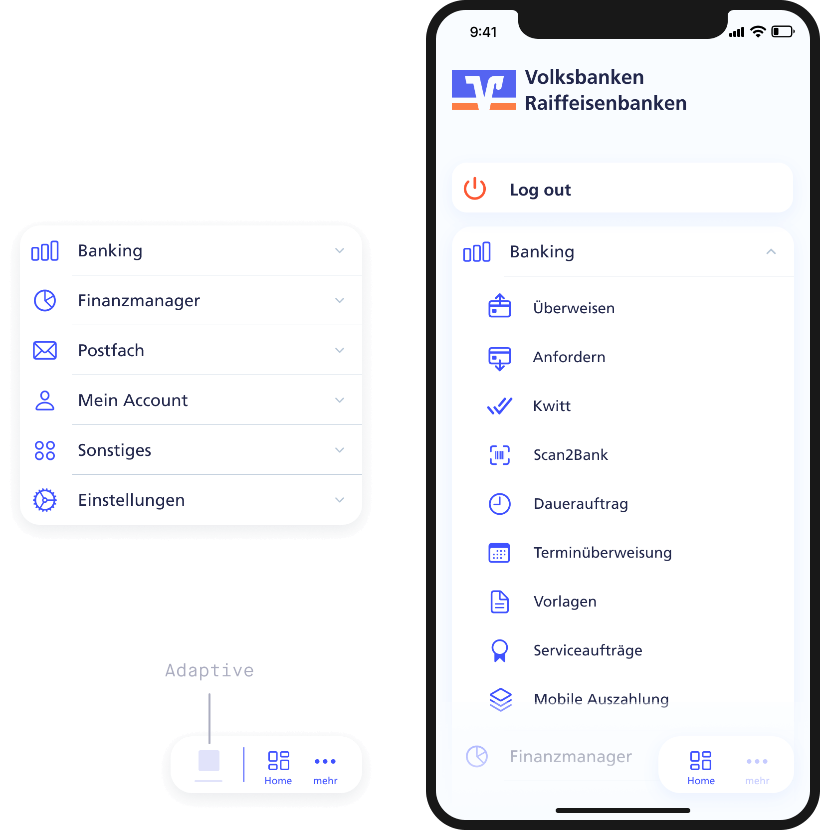
The image shows a smartphone mockup. On the screen, the menu structure of the app is displayed. A log-out button is at the top of the screen, as well as an accordion menu, which is expanded. To the left of the smartphone, the collapsed accordion menu with all six main menu items is floating. Below the card is a small floating navigation button for the bottom-right corner of the screen.

Dashboard

We retained the customizable dashboard to preserve the app's identity and ensure that users see only relevant content. Widgets can be activated or deactivated via the edit button in the menu bar. One feature we appreciated in the original app was the display of information within tiles, providing users with a quick overview.
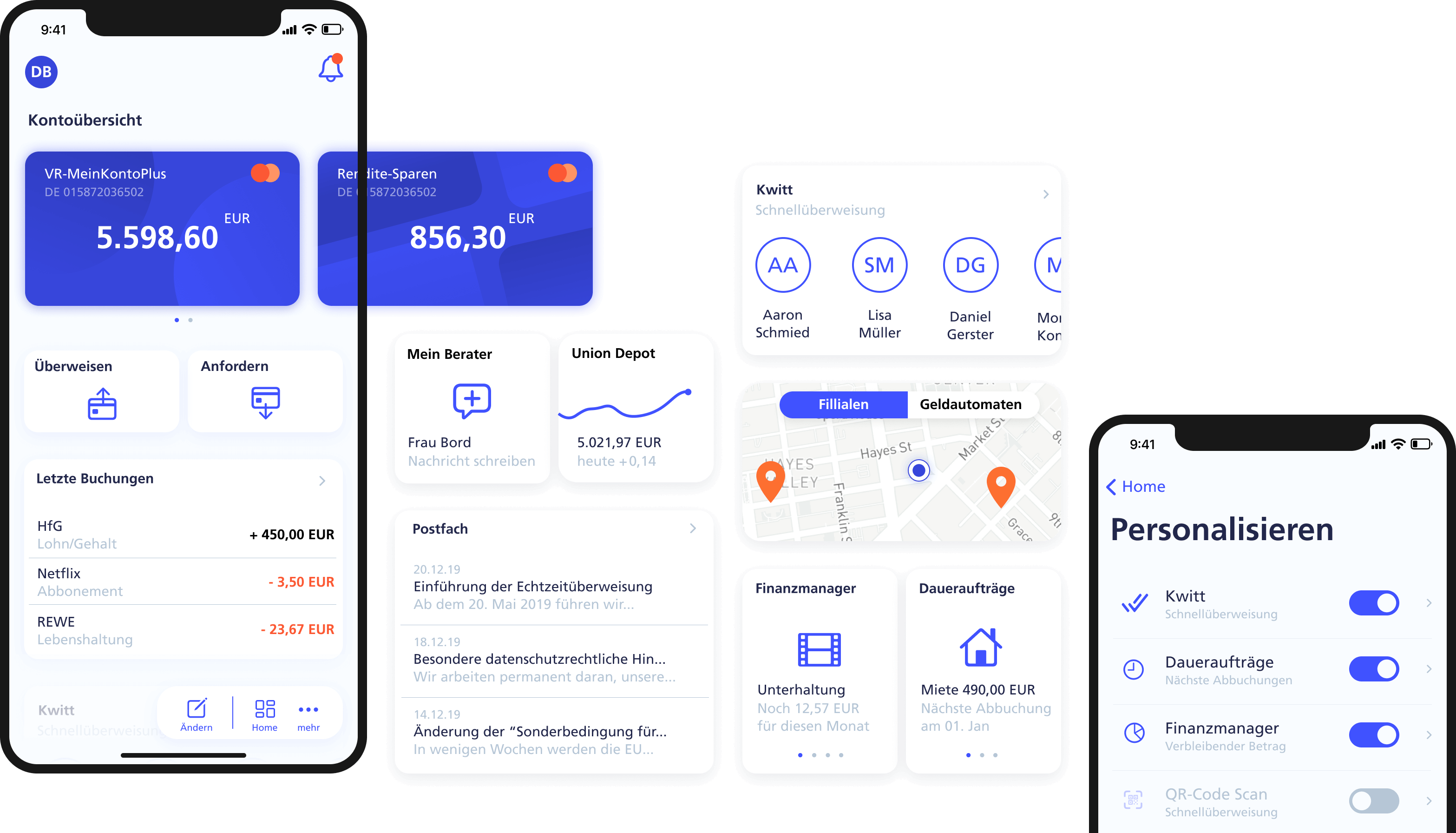
The image shows two smartphone mockups. On the screen of the first smartphone, the user's dashboard is displayed, with multiple buttons and cards arranged vertically and horizontally. The second smartphone shows the screen for personalizing the dashboard. Between both mockups, more potential dashboard cards are floating.

Overview

Instead of a list with all expenses and revenues, we implemented a data visualization with three levels of detail. While the weekly view shows the detailed activity of each day, the annual view gives a rather rough impression. The adaptive navigation allows to only display revenues or expenses, as well as filter by category.
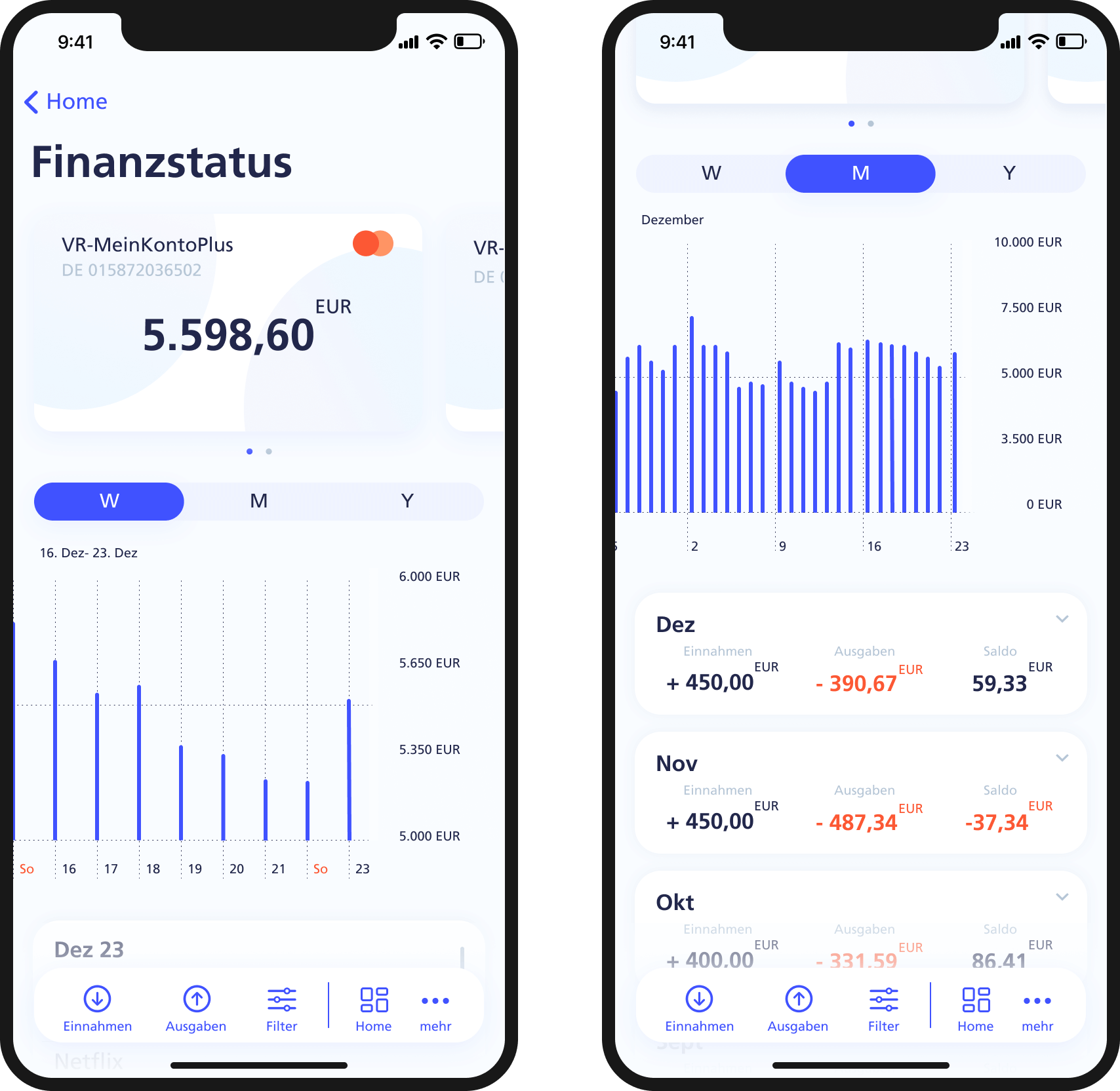
The image shows two smartphone mockups. On the screen of the first smartphone is the financial status screen, showing the current account balance and a chart of the trends over the last weeks, months, and years. The second screen displays the same chart but with the monthly view instead of the weekly view. Additionally, cards with past income and expenses are lined up below the chart.

Finance manager

We introduced the Financial Manager as a new feature to help users proactively plan their expenses and gain a better overview. Users can add individual categories and monthly budgets, and the app automatically assigns expenses to the appropriate categories. This allows users to see how much they can still spend overall or within each category for the month.
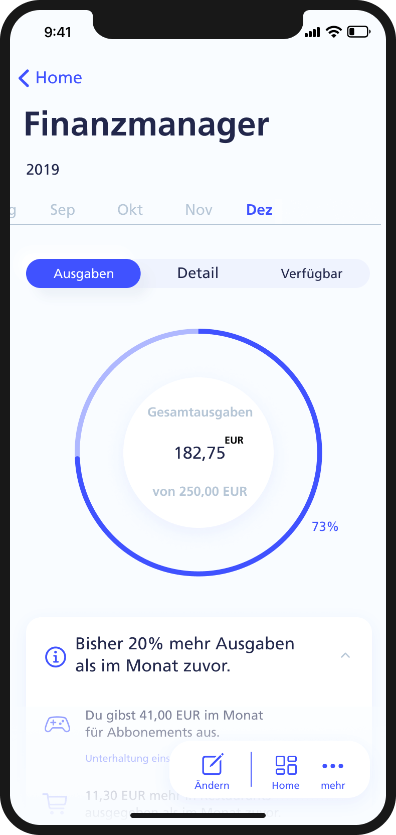
The video shows three smartphone mockups. Each shows a different part of the financial manager screen, with a general and detailed ring chart displaying expenses and available funds.

Transfer money

For the process of tranfering money we have loosened up the originally very packed screens by dividing the process into five steps, allowing the user to perform faster. Options such as templates, photo transfer or via QR code make the process even faster.

Request money

New payment methods are supposed to make the VR-Banking app more appealing to a younger audience. Features such as requesting money or sharing costs are intended to make the banking experience more social and straightforward.
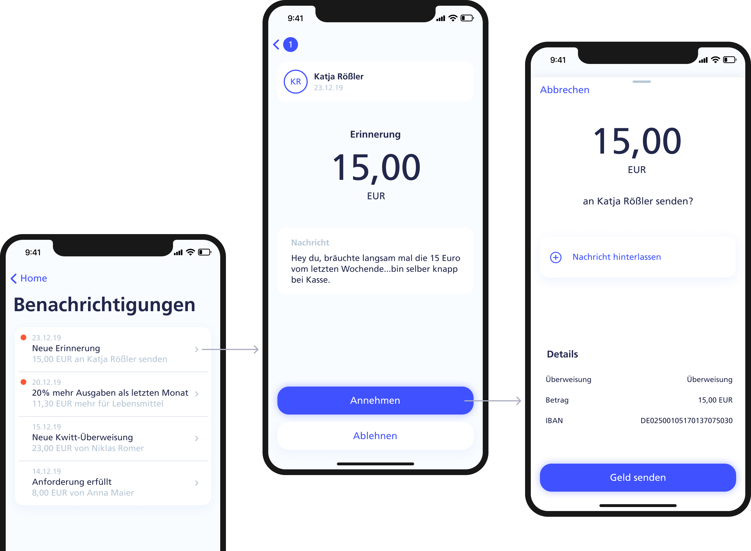
The video shows three smartphone mockups. Each displays a different part of the money request process. Through a notification on the first screen, the user is directed to a detailed view where they accept the money request via a button and send the money, shown on the final screen.

Share costs

You have reached the end

But there is plenty more to see.